> This page is for Developer.
> For clean Markdown of any page, append .md to the page URL.
> For a complete documentation index, see https://docs.makeswift.com/llms.txt.
> For AI client integration (Claude Code, Cursor, etc.), connect to the MCP server at https://docs.makeswift.com/_mcp/server.
# Color
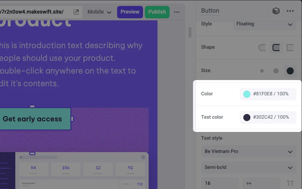
> Adds a Color picker panel in the Makeswift builder to visually edit a RGBA `string` prop.
Adds a Color picker panel in the Makeswift builder to visually edit a RGBA `string` prop.
## Params
**`label`** `string` — default: Text
Text for the panel label in the Makeswift builder.
---
**`description`** `string`
The description shown in the Panel of the Makeswift builder. This can be written in Markdown format.
Added in [`v0.24.8`](https://github.com/makeswift/makeswift/releases/tag/%40makeswift%2Fruntime%400.24.8).
---
**`labelOrientation`** `"vertical" | "horizontal"` — default: horizontal
Position for the color label within the panel.
---
**`defaultValue`** `string | { color: string; opacity: number }`
The value passed to your component when nothing is set in the Makeswift
builder. Accepts either a CSS color string (e.g., `"black"`, `"#4f46e5"`) or an
object with `color` and `opacity` fields (e.g., `{ color: "#4f46e5", opacity: 0.25 }`).
Added in [`v0.28.6`](https://github.com/makeswift/makeswift/releases/tag/%40makeswift%2Fruntime%400.28.6):
object form `{ color, opacity }`.
---
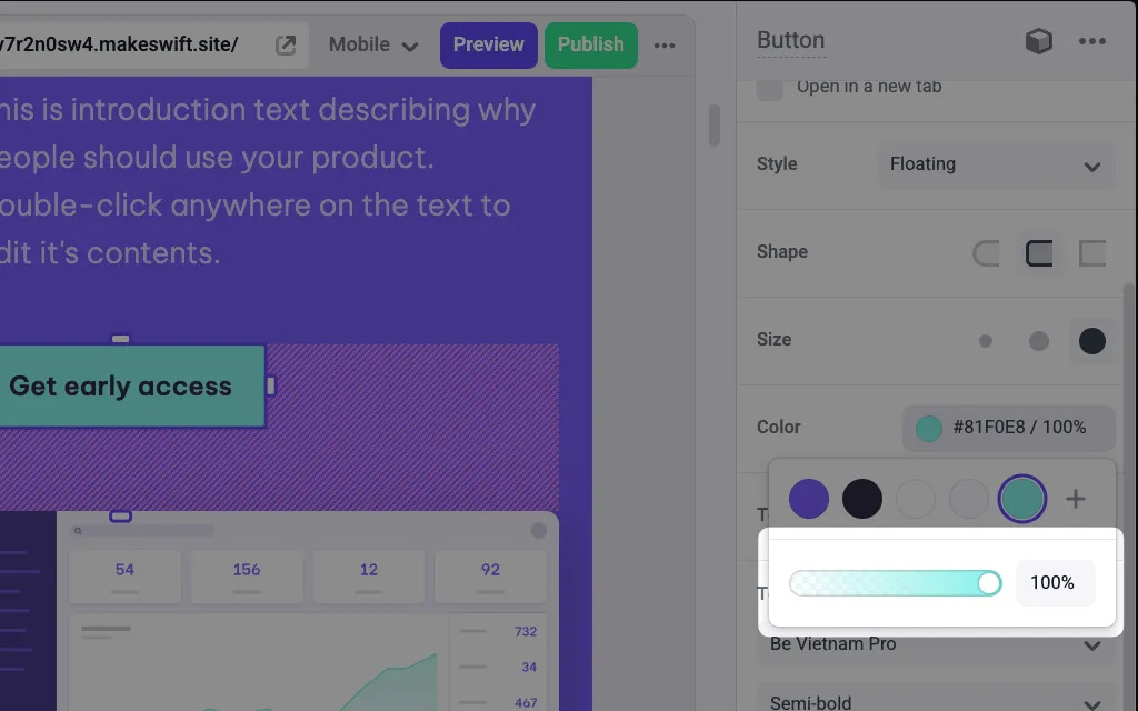
**`hideAlpha`** `boolean`
Indicates whether to hide the alpha channel slider.
#### What is the alpha channel slider?
---
## Prop type
The Color control passes a `string` RGBA value to your component. When a `defaultValue` is provided (either as a string or an object), the resolved prop type narrows to `string` instead of `string | undefined`. If you don't set a `defaultValue` and no value is set in the builder, your component receives `undefined`.
## Example
The following examples add two Color controls to the `backgroundColor` and `color` props of a Button component.
### Using inline styles
**`Button.makeswift.ts`**
```tsx Button.makeswift.ts
import { Color } from "@makeswift/runtime/controls";
import { runtime } from "@/makeswift/runtime";
import { Button } from "./Button";
runtime.registerComponent(Button, {
type: "button",
label: "Button",
props: {
backgroundColor: Color({
label: "Background color",
defaultValue: "black",
}),
color: Color({
label: "Text color",
defaultValue: "white",
}),
},
});
```
**`Button.tsx`**
```tsx Button.tsx
interface Props {
backgroundColor?: string;
color?: string;
}
export function Button({ backgroundColor, color }: Props) {
return (
);
}
```
### Using CSS variables
**`Button.makeswift.ts`**
```tsx Button.makeswift.ts
import { Color } from "@makeswift/runtime/controls";
import { runtime } from "@/lib/makeswift/runtime";
import { Button } from "./Button";
runtime.registerComponent(Button, {
type: "button",
label: "Button",
props: {
backgroundColor: Color({
label: "Background color",
defaultValue: "black",
}),
color: Color({
label: "Text color",
defaultValue: "white",
}),
},
});
```
**`Button.tsx`**
```tsx Button.tsx
import { CSSProperties } from "react";
interface Props {
backgroundColor?: string;
color?: string;
}
export function Button({ backgroundColor, color }: Props) {
return (
);
}
```
### Using object `defaultValue` with opacity
You can pass an object with `color` and `opacity` fields to set a semi-transparent default. Available since [`v0.28.6`](https://github.com/makeswift/makeswift/releases/tag/%40makeswift%2Fruntime%400.28.6).
**`Overlay.makeswift.ts`**
```tsx Overlay.makeswift.ts
import { Color, Style } from "@makeswift/runtime/controls";
import { runtime } from "@/makeswift/runtime";
import { Overlay } from "./Overlay";
runtime.registerComponent(Overlay, {
type: "overlay",
label: "Overlay",
props: {
className: Style(),
overlayColor: Color({
label: "Overlay color",
defaultValue: { color: "#000000", opacity: 0.5 },
}),
},
});
```
**`Overlay.tsx`**
```tsx Overlay.tsx
interface Props {
className?: string;
overlayColor: string;
}
export function Overlay({ className, overlayColor }: Props) {
return (
{/* content */}
);
}
```
> **Info**
>
> `.makeswift.ts` is a naming convention for organizing Makeswift registration code. [Learn more](/developer/docs/reference/reactruntime/register-component#organizing-registration-code).
## Changelog
| Version | Changes |
| ------------------------------------------------------------------------------------------------ | ---------------------------------------------------------- |
| [`v0.28.6`](https://github.com/makeswift/makeswift/releases/tag/%40makeswift%2Fruntime%400.28.6) | Added object form `{ color, opacity }` for `defaultValue`. |
| [`v0.6.3`](https://github.com/makeswift/makeswift/releases/tag/%40makeswift%2Fruntime%400.6.3) | Introduced `Color` control. |