IconRadioGroup
Adds an icon-based radio group panel in the Makeswift builder to visually select a string value from a set of icon options.
Params
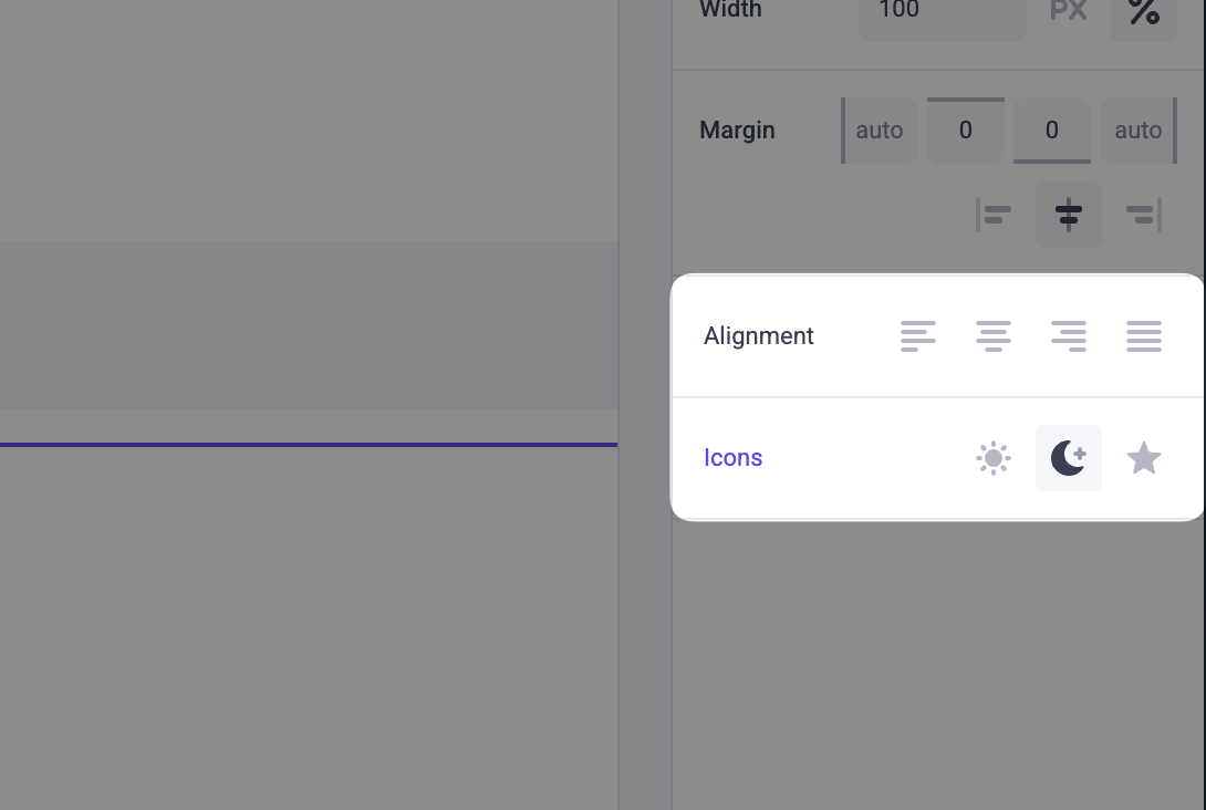
Text for the panel label in the Makeswift builder.
A non-empty array of options displayed as selectable icons in the panel.
The label is shown as a tooltip in the builder. The icon determines which icon is rendered for the option — use a kebab-case string (e.g. 'align-left') or the IconRadioGroup.Icon accessor (e.g. IconRadioGroup.Icon.AlignLeft).
The value passed to your component when nothing is set in the Makeswift builder.
Prop type
The IconRadioGroup control passes the generic type T from the selected option to your component. If you don’t set a defaultValue and no value is set in the builder, your component receives undefined.
Example
The following example adds an IconRadioGroup control to the alignment prop of a TextBlock component using bare kebab-case strings.
Icons
Access icons via IconRadioGroup.Icon or pass a bare kebab-case string. The following icons are available:
.makeswift.ts is a naming convention for organizing Makeswift registration code. Learn more.