
New IconRadioGroup control
The IconRadioGroup control adds an icon-based radio group panel to the Makeswift builder, letting developers offer visual icon options for component properties like alignment, layout direction, or style variants.
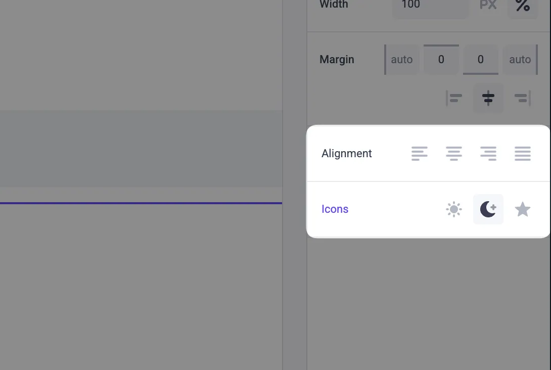
- Kebab-case icon values — Pass icons as bare strings (e.g.,
"text-align-left","arrow-right") or use theIconRadioGroup.Iconaccessor - 169 built-in icons — Full set of icons covering alignment, arrows, layout, logos, and more
- Typed generic prop — The control passes the selected option’s
valueas a typed string to your component
Example
For full documentation, see the IconRadioGroup control reference.