
New Slider control
The Slider control adds a draggable slider to the Makeswift builder, letting content teams set a number prop within a range you define instead of typing a raw value.
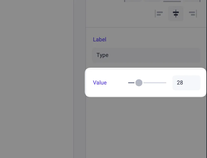
- Bounded range —
min,max, andstepconstrain the values a content editor can set. - Optional numeric input — Set
showInputtotrueto display an input field alongside the slider for precise values. - Plain
numberprop — Your component receives anumber, orundefinedwhen no value is set and nodefaultValueis provided.
Example
For full documentation, see the Slider control reference.