Props

  1. snapshot
    MakeswiftComponentSnapshot
    required
    The Makeswift snapshot to render.
  2. label
    string
    required
    The label of the component used in the Visual Builder.
  3. description
    string
    The description shown in the Panel of the Makeswift builder. This can be written in Markdown format. Added in v0.24.8.
  4. type
    string
    required
    The type of the registered Makeswift component. This should match the type property that was used when calling registerComponent.

Example

The following examples expects that you have integrated Makeswift into your project according to the App Router Installation guide. If you have not, you may need to tweak the code snippets below to match your project setup and file structure.
The following example registers a <Header> component that is editable by the user and will be displayed on each page.
Properties of a header component in the Makeswift Visual Builder

Creating the component

First, you’ll need a React component. Here, we’re going to create one that takes three properties: className, logo, and links.
@/components/header/index.tsx
"use client";

import Image from "next/image";
import Link from "next/link";

interface Props {
  className: string;
  logo: {
    src?: string;
    alt: string;
    width: number;
    height: number;
  };
  links: Array<{
    label: string;
    link: { href: string };
  }>;
}

export function Header({ className, links, logo }: Props) {
  return (
    <header className={className}>
      <nav className="mx-auto max-w-6xl flex items-center justify-between gap-4 p-8">
        {logo?.src && (
          <div className="flex items-center justify-start self">
            <Image
              src={logo.src}
              alt={logo.alt}
              width={logo.width}
              height={logo.height}
            />
          </div>
        )}

        <ul className="flex gap-6">
          {links.map((item, i) => (
            <li key={i} value={i.toString()}>
              <Link href={item.link.href}>{item.label}</Link>
            </li>
          ))}
        </ul>
      </nav>
    </header>
  );
}

Registering with Makeswift

Next, this component needs to be registered with Makeswift. This example registers the same three properties: className, logo, and links. Notice these property names match the property names defined in the Header component.
In registerComponent the hidden property is set to true which hides it from being listed in the Component Tray. This is because we will be hard-coding where this component will be incorporated into the page and we don’t want the user to drag and drop multiple instances of it.
@/components/header/register.ts
import {
  Group,
  Image,
  Link,
  List,
  Number,
  Style,
  TextInput,
} from "@makeswift/runtime/controls";

import { Header } from "./";

import { runtime } from "@/makeswift/runtime";

export const HEADER_COMPONENT_TYPE = "makeswift-header";

const logo = Group({
  label: "Logo",
  preferredLayout: Group.Layout.Popover,
  props: {
    src: Image({ label: "Logo" }),
    alt: TextInput({ label: "Alt text", defaultValue: "Logo alt" }),
    width: Number({ label: "Width", suffix: "px", defaultValue: 200 }),
    height: Number({ label: "Height", suffix: "px", defaultValue: 200 }),
  },
});

const links = List({
  label: "Links",
  type: Group({
    label: "Link",
    props: {
      label: TextInput({ label: "Text", defaultValue: "Text" }),
      link: Link({ label: "URL" }),
    },
  }),
  getItemLabel: (item) => item?.label ?? "Text",
});

runtime.registerComponent(Header, {
  type: HEADER_COMPONENT_TYPE,
  label: "Site Header",
  hidden: true,
  props: {
    className: Style(),
    logo,
    links,
  },
});
You’ll then need to import this component into your makeswift/components.ts file with the rest of your components. If you don’t already have this file, refer to the App Router Installation guide to ensure it’s created and imported in the correct places.

Rendering the component

Then, you’ll need to retrieve the snapshot of the component from the Makeswift API by calling getComponentSnapshot with a unique ID and pass that snapshot to <MakeswiftComponent>. 
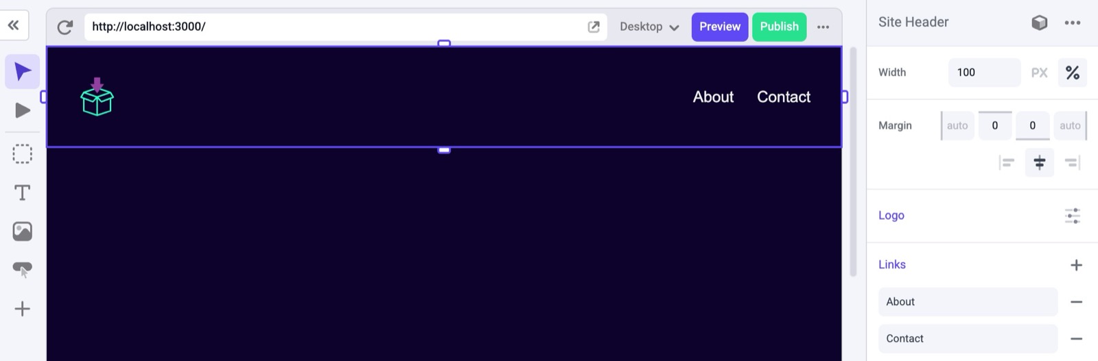
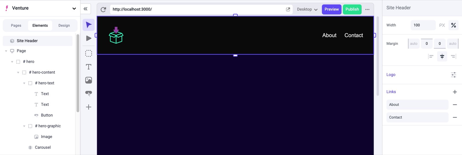
Here, we are adding the <Header> to the root layout.tsx file so that it shows up on each page.
@/app/layout.tsx
import { draftMode } from "next/headers";
import { MakeswiftProvider } from "@/makeswift/provider";
import "@/makeswift/components";
import "./globals.css";
import { MakeswiftComponent } from "@makeswift/runtime/next";
import { getSiteVersion } from "@makeswift/runtime/next/server";
import { HEADER_COMPONENT_TYPE } from "@/components/header/register";
import { client } from "@/makeswift/client";

export default async function RootLayout({
  children,
}: Readonly<{
  children: React.ReactNode;
}>) {
  const myHeaderSnapshot = await client.getComponentSnapshot(
    `my-header-id`, //unique identifier of the component rendered on the page
    { siteVersion: await getSiteVersion() }
  );

  return (
    <html lang="en">
      <body>
        <MakeswiftProvider previewMode={(await draftMode()).isEnabled}>
          <MakeswiftComponent
            snapshot={myHeaderSnapshot}
            label={`Site Header`}
            type={HEADER_COMPONENT_TYPE}
          />
          {children}
        </MakeswiftProvider>
      </body>
    </html>
  );
}
The header should now be visible on each page within the Visual Builder.
Header component showing on a page in the Makeswift Visual Builder

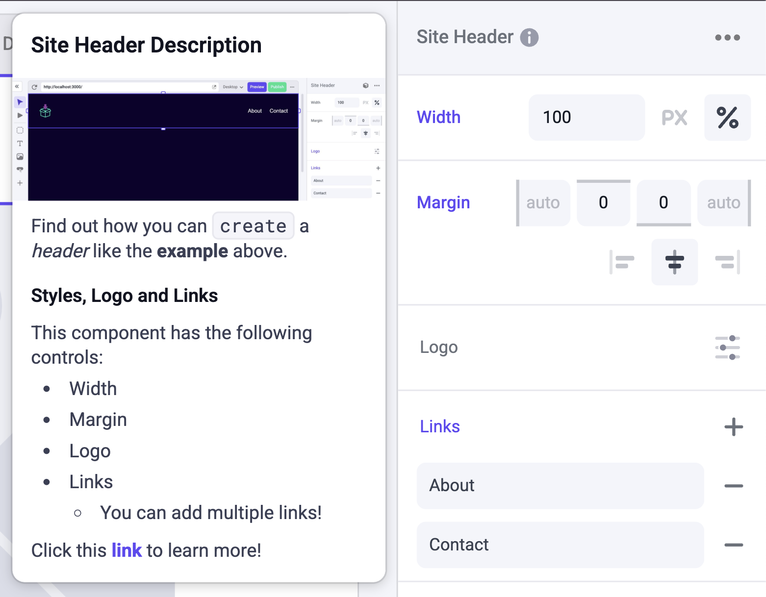
Adding a description

We can define a description string using markdown formatting, and then in this `layout.tsx’ we can add the description field.
const mdDescription = `
# Site Header Description

![Site Header Example](https://mintlify.s3.us-west-1.amazonaws.com/makeswift/images/developer/reference/makeswift-component/header-example.jpg)

Find out how you can \`create\` a *header* like the **example** above.

## Styles, Logo and Links

This component has the following controls:
* Width
* Margin
* Logo
* Links
  * You can add multiple links!

Click this [link](https://docs.makeswift.com/product/introduction) to learn more!
`
@/app/layout.tsx
...

          <MakeswiftComponent
            snapshot={myHeaderSnapshot}
            label={`Site Header`}
            type={HEADER_COMPONENT_TYPE}
            description = {mdDescription}
          />
...

You should now be able to see an info icon next to the label when selecting the component in the Visual Builder. To view your description, simply hover over the label and the tooltip will open.
Site header description open