Makeswift on Stencil
Makeswift works on BigCommerce-hosted Stencil storefronts, using predefined theme regions to define where the Visual Builder can be used.
A Makeswift workspace and site for your Stencil storefront are created through the BigCommerce control panel as part of the setup flow — not directly within Makeswift. User accounts are also automatically provisioned through this process.
If you don’t see this option in your control panel, your store may not be enrolled yet. To express interest in gaining access, fill out the Makeswift on Stencil Early Access Form.
Pages
For Stencil, BigCommerce is the source of truth for all page URLs and metadata — pages must be created and managed there first. While you can create a page in Makeswift and set a URL path, those settings won’t affect how the page is served; only BigCommerce controls routing and SEO for Stencil pages.
Once a page exists in BigCommerce, you can navigate to it in the Visual Builder by entering its URL path in the canvas address bar, or by switching to Interact mode and navigating to the page as a shopper would.
If you create a page in Makeswift using the same URL route as a page in BigCommerce, this acts as a bookmark, making the page easy to find in the sidebar.
Regions
Editing on a Stencil storefront is organized around regions — specific areas of the page defined by your theme (the same regions that Page Builder uses). In the Elements panel, regions appear as the top-level items for each page, and each one is an independent area where you can add and manage content.
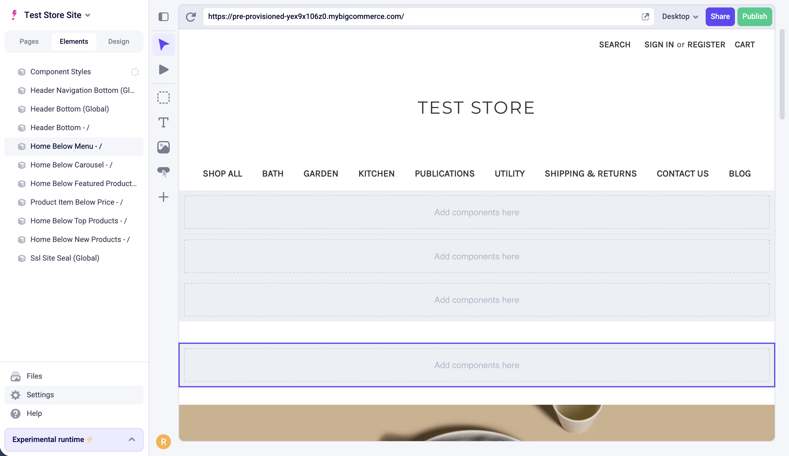
Global regions are supported — any content added to one will appear on every page that contains that region. In the Elements panel, global regions are labeled with (Global) after their name.
For more detailed information on theme regions, see the developer documentation on regions.
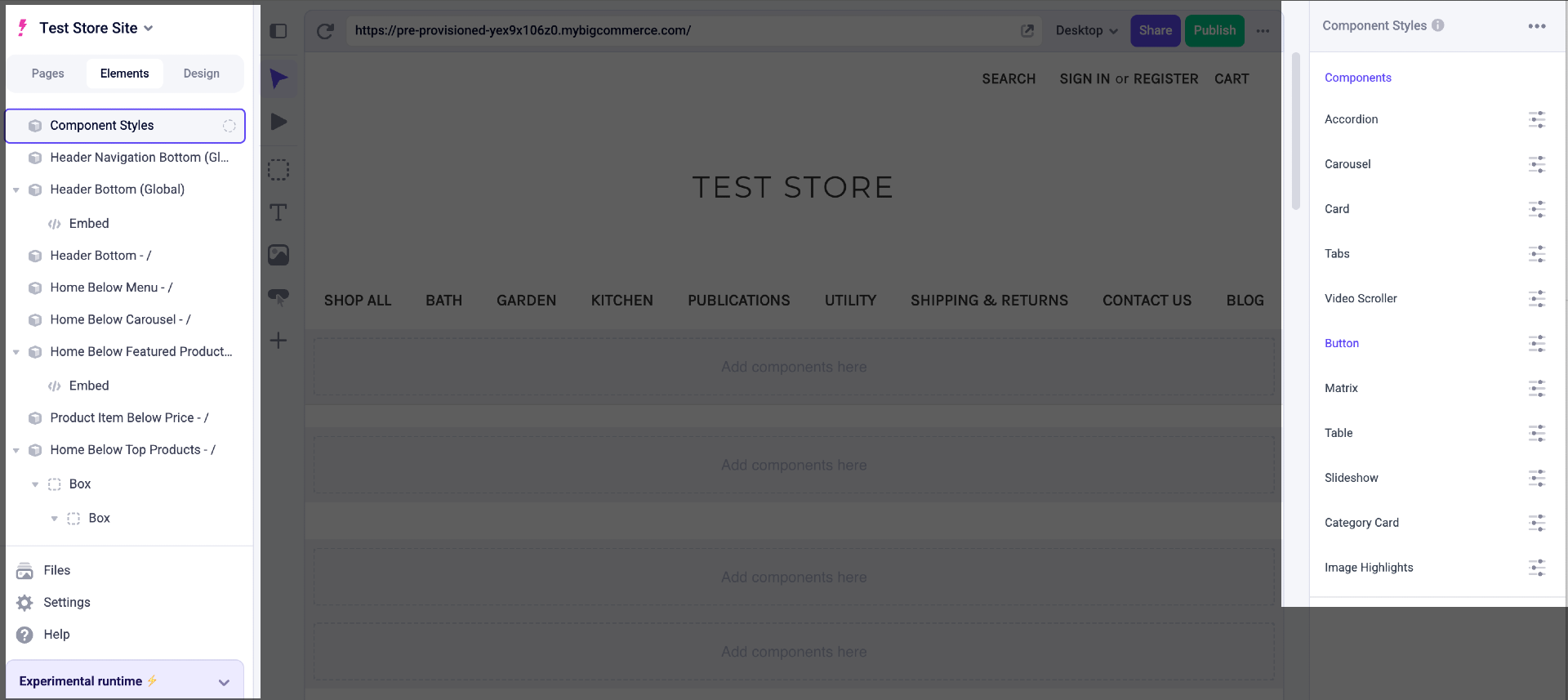
Component Styles
Component Styles let you customize the theming and appearance of Makeswift components. Changes here apply to all instances of a component across your Makeswift site. These styles do not affect content managed directly in your Stencil theme.
Component Styles can be found in the Elements panel.
Page Builder content
Makeswift supports multiplayer editing, autosave, and selective publishing — features not available in Page Builder.
If you’re coming from Page Builder (the older visual editor for Stencil storefronts), some regions may already contain content built with Page Builder widgets. This content will be shown in Makeswift. To rebuild a region in Makeswift instead, select the region in the Elements panel or directly in the canvas and uncheck Show Page Builder content in the Properties sidebar. This replaces the Page Builder content with an empty Makeswift slot.
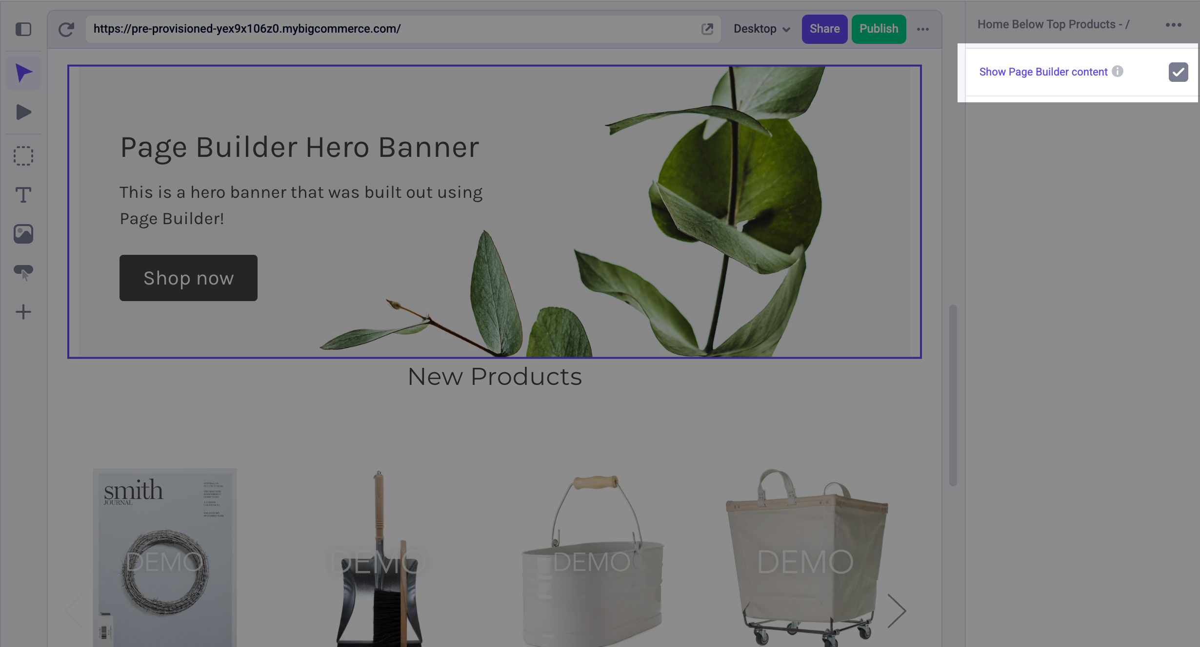
Your Page Builder content is not deleted — you can re-check Show Page Builder content at any time to restore it.
You can use this toggle as a reference point while rebuilding. Switch back to your Page Builder content to compare, then uncheck it again to continue working in Makeswift.
Components
Makeswift on Stencil includes the standard built-in components, but also includes a suite of additional Stencil-specific components such as:
Accordion
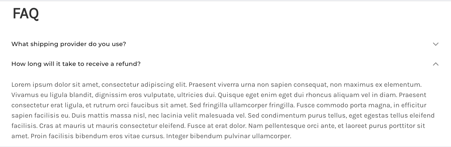
Accordions add a list of drop-down content to your webpage. This is useful for reducing the page space of longer content, such as a list of frequently-asked questions.
- Width — Define the component’s width on your page. You can set an absolute width in pixels, or you can set a responsive width that adjusts to a specified percentage of any device’s screen size.
- Margin — Define the space between the accordion list and adjacent components in the same layer. For how to use the Margin property, see Makeswift’s article on Margin.
- Selection Type — Control whether multiple accordion items can be expanded at the same time, or only one at a time.
- Items — Add drop-down sections to the list and define the title and content of each.
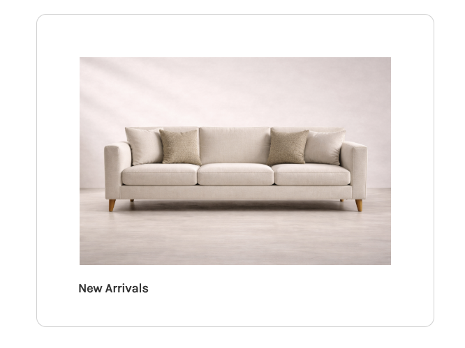
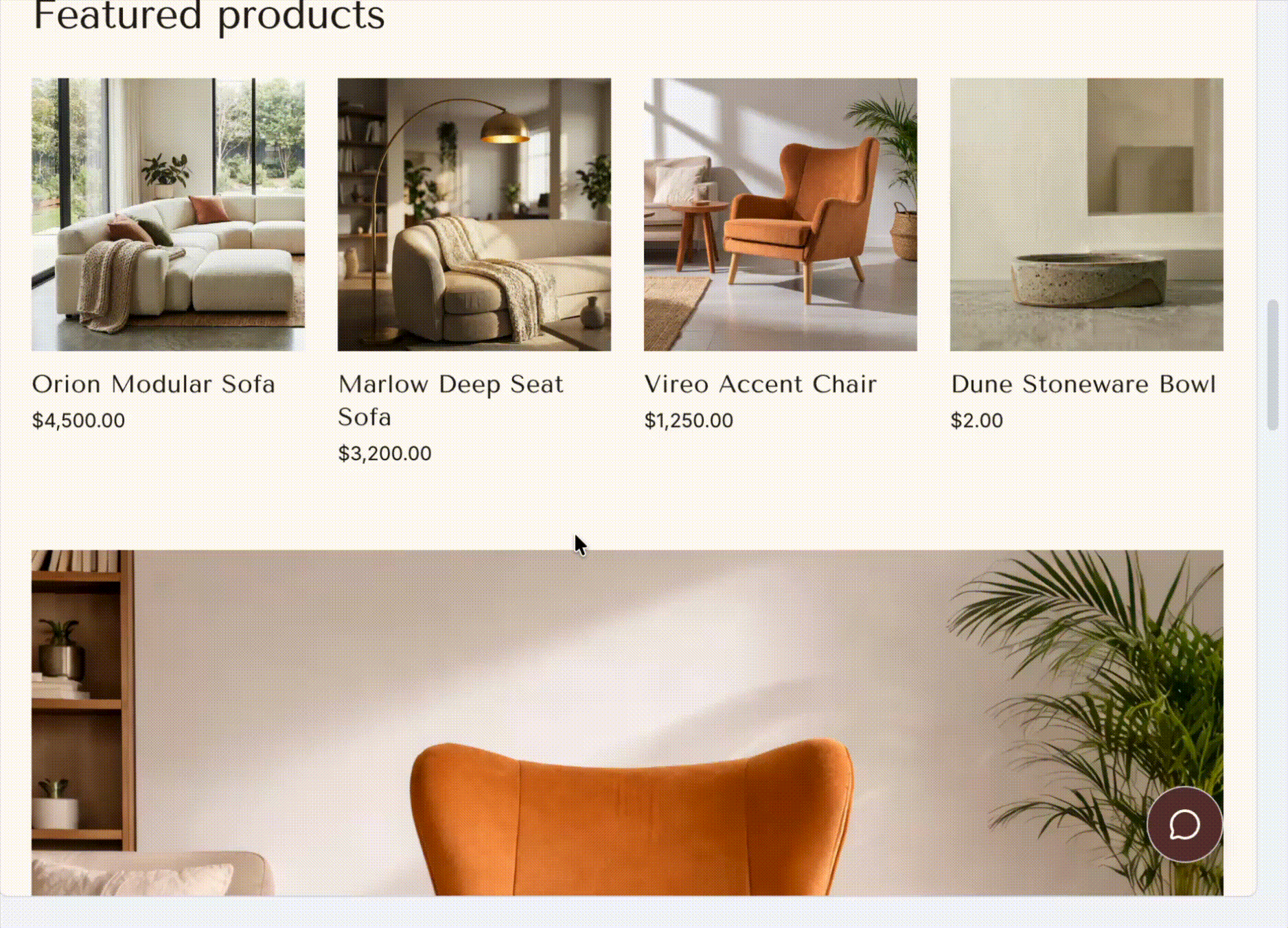
Card
Card components consist of an image with caption text placed underneath. These allow you to create a visual list of content from scratch.
- Width — Define the component’s width on your page. You can set an absolute width in pixels, or you can set a responsive width that adjusts to a specified percentage of any device’s screen size.
- Margin — Define the space between the card and adjacent components in the same layer. For how to use the Margin property, see Makeswift’s article on Margin.
- Visibility — Control the visibility of individual elements nested within the card.
- Card Link — Add a link to the card.
- Link Aria Label — Add an accessible label to the card’s link for screen readers. Use this when the card’s visual content alone doesn’t provide enough context about where the link goes.
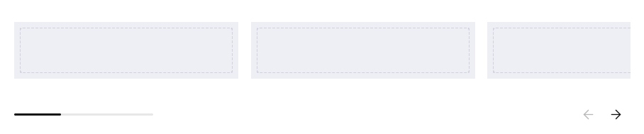
Carousel
Add components to each slide space for a more customizable carousel.
- Width — Define the component’s width on your page. You can set an absolute width in pixels, or you can set a responsive width that adjusts to a specified percentage of any device’s screen size.
- Margin — Define the space between the carousel and adjacent components in the same layer. For how to use the Margin property, see Makeswift’s article on Margin.
- Slides — Add slides to your carousel. Each slide has its own editable region where you can add other components.
- Show Scrollbar — Enable this to display the carousel’s horizontal scrollbar.
- Show Navigation — Enable this to display the left and right arrow buttons.
Divider
Divider components add a horizontal line to separate different layers of the webpage. Use this component to visually distinguish between content blocks, such as dividing multiple product lists.
- Style — Specify if the dividing line should appear solid, dashed, dotted, or blended into the background.
- Height — Enter the divider’s vertical thickness in pixels.
- Color — Use the color picker or select from your list of site-level colors, and specify the color opacity.
- Width — Define the component’s width on your page. You can set an absolute width in pixels, or you can set a responsive width that adjusts to a specified percentage of any device’s screen size.
- Margin — Define the space between the divider and adjacent components in the same layer. For a detailed explanation of how to use the Margin property, see Makeswift’s article on Margin.
Embed
Embed components allow you to add custom HTML code to the webpage, including style and script tags.
- Code — Enter your HTML code for the component.
- Width — Define the component’s width on your page. You can set an absolute width in pixels, or you can set a responsive width that adjusts to a specified percentage of any device’s screen size.
- Margin — Define the space between the embedded content and adjacent components in the same layer. For a detailed explanation of how to use the Margin property, see Makeswift’s article on Margin.
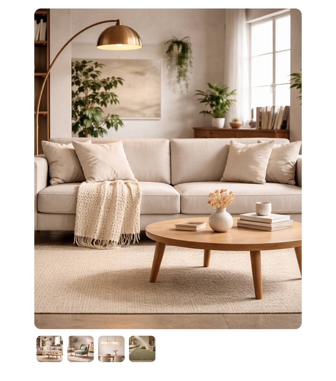
Gallery
Gallery components display a collection of images with a large focused view and thumbnail previews below. Clicking a thumbnail brings it into focus as the main image.
- Width — Define the component’s width on your page. You can set an absolute width in pixels, or you can set a responsive width that adjusts to a specified percentage of any device’s screen size.
- Margin — Define the space between the gallery and adjacent components in the same layer. For a detailed explanation of how to use the Margin property, see Makeswift’s article on Margin.
- Images — Add the images to your gallery.
- Aspect Ratio — Select the height and width proportions for the image.
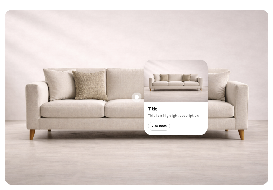
Image Highlights
Image Highlights lets you place interactive hotspots on an image. Each hotspot has its own title, description, image, and button, allowing you to surface additional context or actions at specific points within the image.
- Width — Define the component’s width on your page. You can set an absolute width in pixels, or you can set a responsive width that adjusts to a specified percentage of any device’s screen size.
- Margin — Define the space between the component and adjacent components in the same layer. For a detailed explanation of how to use the Margin property, see Makeswift’s article on Margin.
- Main Image — The primary image that hotspots are placed on.
- Image Alt Text — The alt text for the main image.
- Aspect Ratio — Select the height and width proportions for the image.
- Content Side — Set which side of the hotspot marker the popup appears on.
- Content Alignment — Set whether the popup is aligned to the left, center, or right of the hotspot marker.
- Highlights — Add hotspot markers to the image. Each highlight has the following properties:
- X Position — The horizontal position of the hotspot on the image.
- Y Position — The vertical position of the hotspot on the image.
- Title — The title displayed in the hotspot popup.
- Description — The description text displayed in the hotspot popup.
- Image — An image displayed in the hotspot popup.
- Image Alt Text — The alt text for the hotspot’s image.
- Button Text — The label for the button in the hotspot popup.
- Link — The URL the button links to.
Matrix
Matrix components display data in a grid format with defined row and column headers and values for each cell.
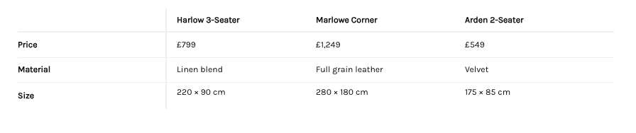
- Width — Define the component’s width on your page. You can set an absolute width in pixels, or you can set a responsive width that adjusts to a specified percentage of any device’s screen size.
- Margin — Define the space between the matrix and adjacent components in the same layer. For a detailed explanation of how to use the Margin property, see Makeswift’s article on Margin.
- Spacing — Set the density of the table layout. Choose Default for standard cell padding, or Condensed to reduce the spacing between cell borders and text for a more compact view.
- Show Borders — Toggle the visibility of interior cell borders.
- Max Height (px) — Set a maximum height for the table in pixels.
- Corner Header — Set the label for the top-left cell of the table. Requires at least one column header to be defined.
- Column Headers — Add column headers to the table.
- Rows — Add rows to the table and define values for cells.
Slideshow
Slideshow displays a slide deck that automatically transitions between slides.
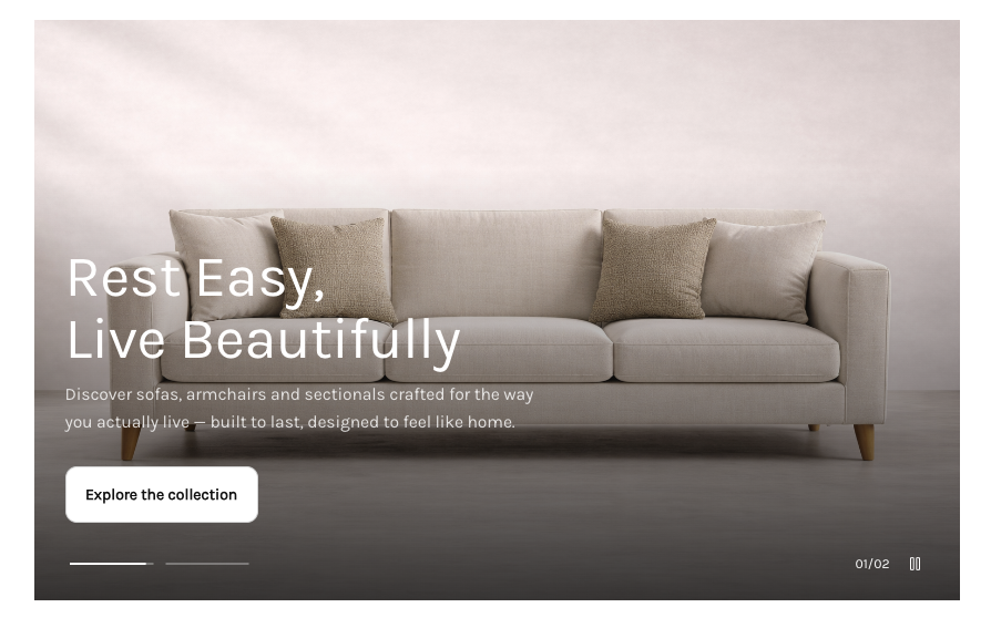
- Width — Define the component’s width on your page. You can set an absolute width in pixels, or you can set a responsive width that adjusts to a specified percentage of any device’s screen size.
- Margin — Define the space between the slideshow and adjacent components in the same layer. For a detailed explanation of how to use the Margin property, see Makeswift’s article on Margin.
- Slides — Add slides to your slideshow.
- Show Pagination — Show or hide controls for jumping to a specific slide.
- Show Counter — Display the current slide position out of the total (e.g., 1 of 5).
- Show Play Button — Show the controls for pausing and playing the slideshow.
- Autoplay — Automatically advance through slides without user interaction.
- Loop — Restart the slideshow from the first slide after the last slide is reached.
- Interval (ms) — Set the amount of time in milliseconds between slide transitions.
Table
Table components display data in a grid format with defined column headers and rows. Unlike the Matrix component, tables do not support row headers.
- Width — Define the component’s width on your page. You can set an absolute width in pixels, or you can set a responsive width that adjusts to a specified percentage of any device’s screen size.
- Margin — Define the space between the table and adjacent components in the same layer. For a detailed explanation of how to use the Margin property, see Makeswift’s article on Margin.
- Spacing — Set the density of the table layout. Choose Default for standard cell padding, or Condensed to reduce the spacing between cell borders and text for a more compact view.
- Show Borders — Toggle the visibility of interior cell borders.
- Max Height (px) — Set a maximum height for the table in pixels.
- Columns — Add columns to the table.
- Rows — Add rows to the table and define values for cells.
Tabs
Tabs allow you to organize content into labeled sections. Each tab contains its own editable slot where you can add other components. Clicking a tab displays the content associated with that tab.
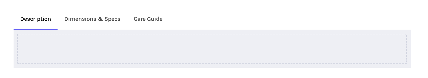
- Width — Define the component’s width on your page. You can set an absolute width in pixels, or you can set a responsive width that adjusts to a specified percentage of any device’s screen size.
- Margin — Define the space between the tabs and adjacent components in the same layer. For a detailed explanation of how to use the Margin property, see Makeswift’s article on Margin.
- Default Tab Value — Set which tab is selected by default by entering a value that matches one of your tab’s values.
- Tabs — Add tabs and define their labels.
Video
Use this component to add online video content to your store.
- Video URL — Enter a video link from any hosting platform, and then configure the following settings:
- Autoplay — Enable this to play the video automatically when the webpage is opened.
- Show Controls — Display or hide the video menu for viewers.
- Loop — Enable this to automatically replay the video when it ends.
- Muted — Specify whether or not the video’s sound is muted by default.
- Width — Define the component’s width on your page. You can set an absolute width in pixels, or you can set a responsive width that adjusts to a specified percentage of any device’s screen size.
- Margin — Define the space between the video and adjacent components in the same layer. For a detailed explanation of how to use the Margin property, see Makeswift’s article on Margin.
- Corners — Increase the value to round the corners of the video. You can apply this uniformly to all corners, or set a unique value for each corner. Note that higher corner values can hide parts of the video menu.
Video Scroller
Video Scroller plays a video in sync with the user’s scroll position on the page.
- Width — Define the component’s width on your page. You can set an absolute width in pixels, or you can set a responsive width that adjusts to a specified percentage of any device’s screen size.
- Margin — Define the space between the video scroller and adjacent components in the same layer. For a detailed explanation of how to use the Margin property, see Makeswift’s article on Margin.
- Video URL — The URL of the video. Supported formats are MP4, WebM, and OGG.
- Scroll Amount — How many full pages of scrolling it takes to play the video.
- Segments — Add text overlays to the video. Multiple segments can be defined and will play sequentially.
Locales
Locales for Stencil storefronts are managed in the BigCommerce control panel. Any additional languages and their subfolder path structure are synced over from BigCommerce automatically.
FAQ
Can I use Makeswift while my Stencil storefront is down for maintenance or in prelaunch?
Makeswift loads your live storefront in the Visual Builder, so the storefront must be accessible in order to edit.
- Down for maintenance — The storefront must be launched and active. You can’t edit in Makeswift while the store is in maintenance mode.
- Prelaunch — You can edit a store that is in prelaunch, but you need to enter your store’s preview code first. When you open the Visual Builder, the storefront’s preview code prompt is displayed in the canvas. Enter the code to load the storefront, and then continue editing as usual.
Can I create custom components?
Custom components are not supported at this time.
Social Links
This component adds a horizontal list of icons, which allow you to link to your business’s social media pages, similar to the social media links included with Stencil storefronts.