Responsive design
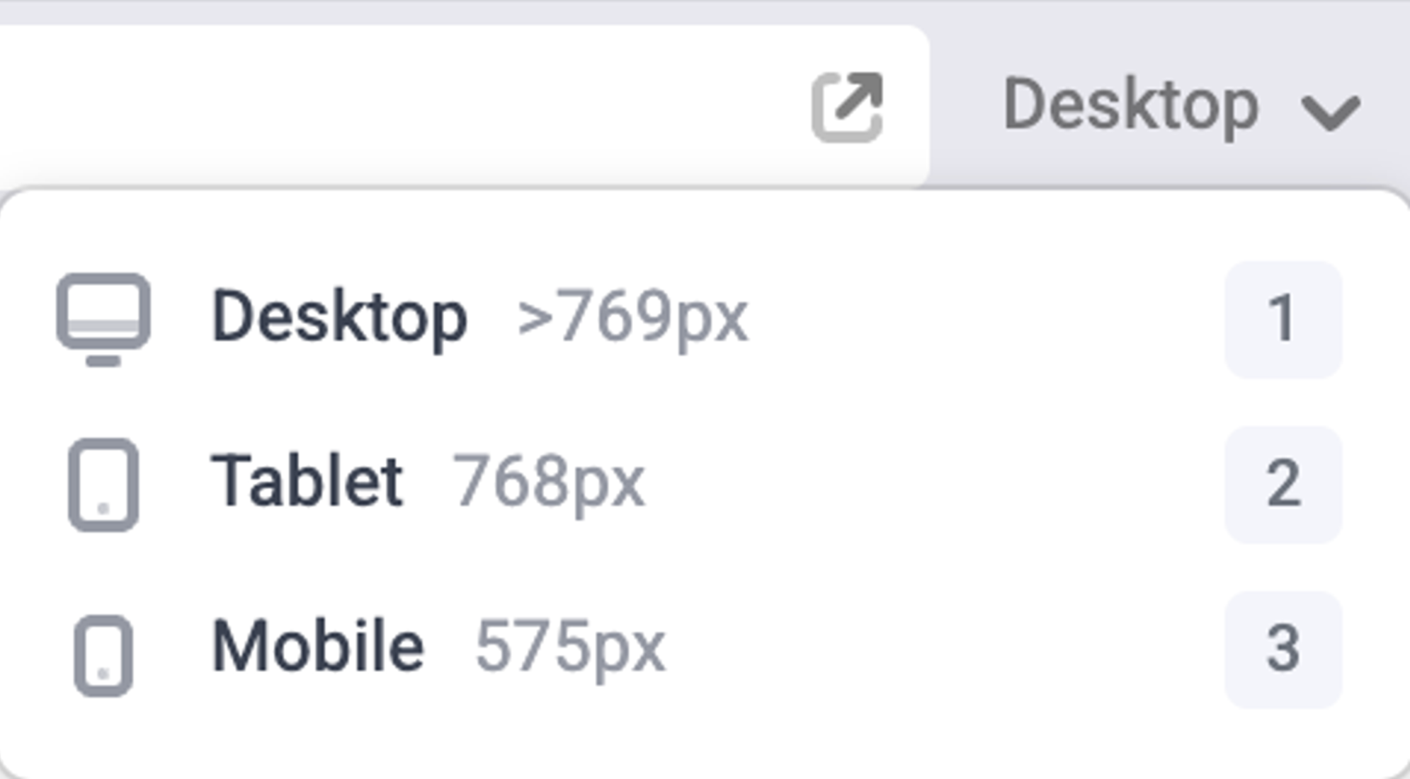
Responsive design refers to the optimization of your page designs for different screen sizes. You can switch device modes at the top center of the page builder browser bar to switch into that breakpoint.
Designing for mobile and tablet
In Makeswift, styles always cascade from larger devices to smaller ones. Once a style has been overridden on a smaller device, that specific style will no longer be affected by changes from a larger device. All element and text styles can be set per device. Things such as text content, images, sorting elements, or changing links are not responsive.
Select an element and switch to a smaller device. If a style is being inherited from a larger device, the label for it’s panel will be gray.
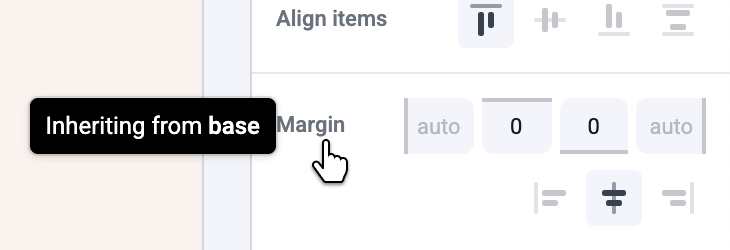
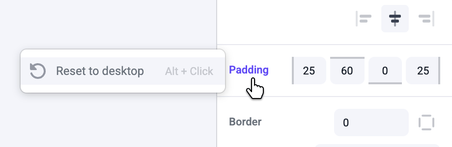
Making an edit to the style on a smaller device will change the label color to blue. Clicking the blue label will open an option to revert changes back to the larger device.
Building responsive layouts
Select a box containing multiple elements in a single row. Vertical dashed lines appear in between each element. Click anywhere on a vertical dashed line to split the row.
A horizontal dashed line will now be displayed between the two rows. Clicking the horizontal line will join the adjacent rows back into a single row. Different breakpoints can be set on different device modes.
Hiding elements
To hide an element, select the box that element is located within. Then in the visibility panel, click on its correlating rectangle within the panel. A hidden element is shown as a collapsed rectangle with a gray border.
In this example, the feature section meant for mobile devices is hidden on desktop devices.
You can utilize visibility to deliver completely different content experiences between devices. Simply add all of the content you would want to show and utilize the visibility property per device to customize each experience.