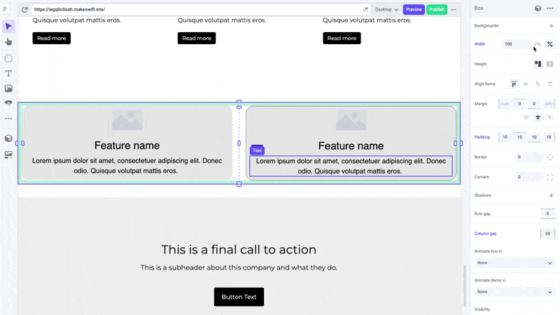
Width
The width panel makes it easy to adjust the width of elements on your pages. With intuitive handles and inputs, you can quickly set exact pixel widths or percentages to get your layout just right.
Makeswift ensures that elements are responsive and can adapt seamlessly to different screen sizes. The width of elements defaults to 100% of the maximum pixel width of your device.
Pro tips
When creating a new section on a page, we suggest dropping in a box and setting its width to 100%. This will allow you to add a background and have it fill up the entire section. You can then add a content box within that section and set the width to a maximum pixel width, such as 1280px, to keep your content from stretching too wide on larger screens.
Avoid using padding instead of width for boxes. Width allows your element to resize responsively while maintaining a limit to prevent it from becoming too wide on larger screens. Padding is a hard pixel value that does not automatically get reduced and will cause your content to be squished on smaller devices.
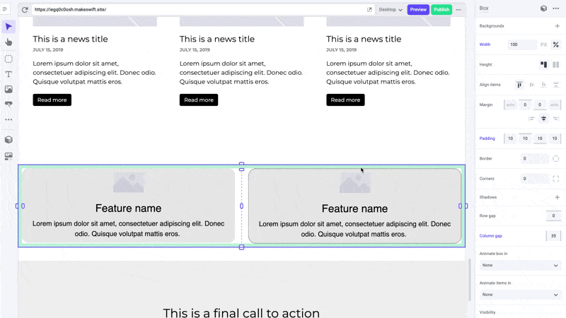
Shortcuts
You can manually set the value of either pixel and percentage width in the panel sidebar, however to quickly adjust an element to 100% width, you can simply drag it to full width.
Developer notes
You can give your team control over the width property for any custom component using the Style control.