Prerequisites
This guide assumes that you are using TypeScript and have followed the App Router Installation guide for your initial project setup. It also assumes you are using a src directory. If your setup varies from this, please adjust the code snippets appropriately.Overview
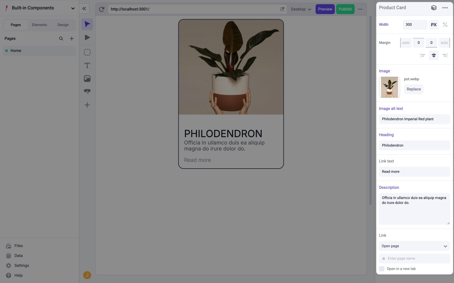
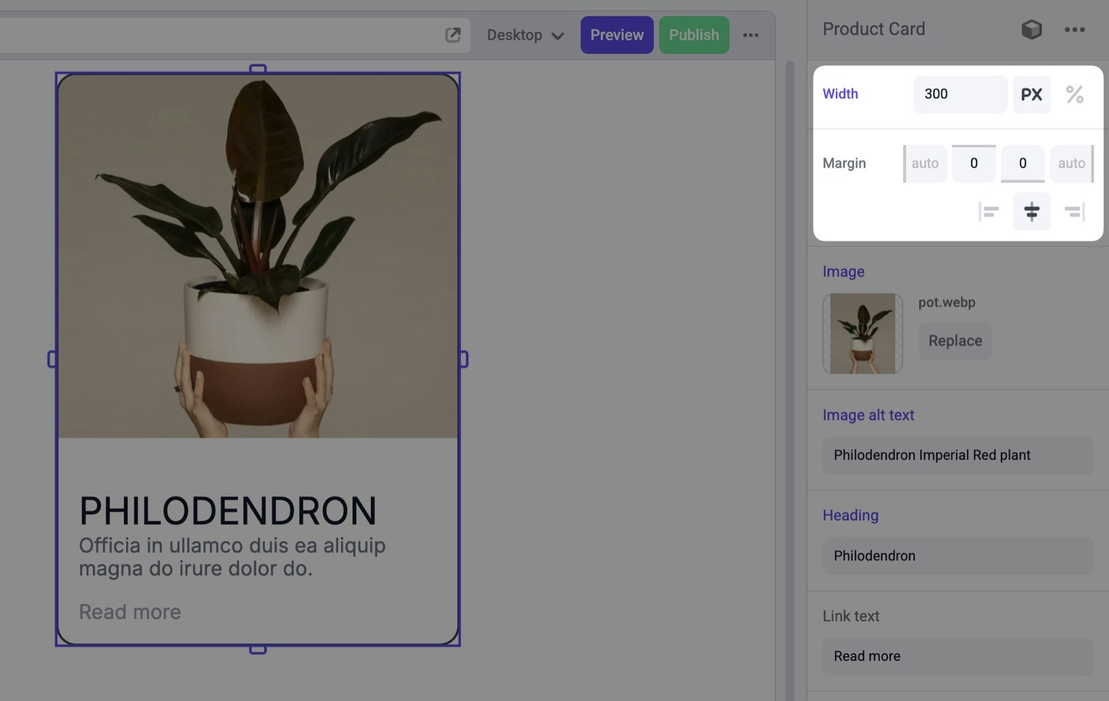
In this guide, we’re going to build aCard component that can be used to display product data. This component will need a few different properties:
image- the URL of the imagealt- the alt text to use for the imageheading- the heading textdescription- the description textlink- the link to navigate tolinkText- the text of the link

- A React component
- A file that registers the component with Makeswift
Creating the React component
Start by creating asrc/components/Card directory and add an index.tsx file. Then, define a type for the component props based on our requirements.
src/components/Card/index.tsx
src/components/Card/index.tsx
Registering the component
After creating the React component, we need to register that component with Makeswift. This makes the component available in the Component Tray for users to drag onto the canvas.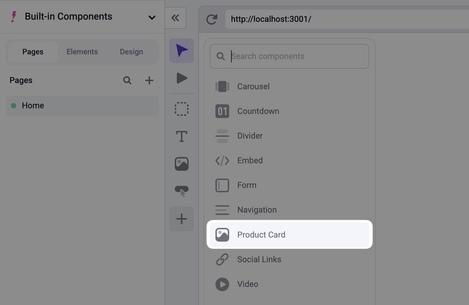
ReactRuntime defined in src/makeswift/runtime.ts.
When calling, registerComponent, you’ll need to pass the React component to be registered as well as a config object with three required properties:
type- a unique identifier for the componentlabel- the label that shows up in the Visual Builderprops- an object mapping of prop names to Makeswift controls
src/components/Card/Card.makeswift.tsx
Adding an icon
Additionally, you can include an optionalicon property in your configuration object to specify which icon to be displayed along side your component. In this example, we’ll use the image icon.
src/components/Card/Card.makeswift.tsx
Defining props
At this point, you should see an error in your editor on the reference to theCard component. This is because we set props to be an empty object. However, props should be a mapping of properties to Makeswift controls that match the props the Card component expects.
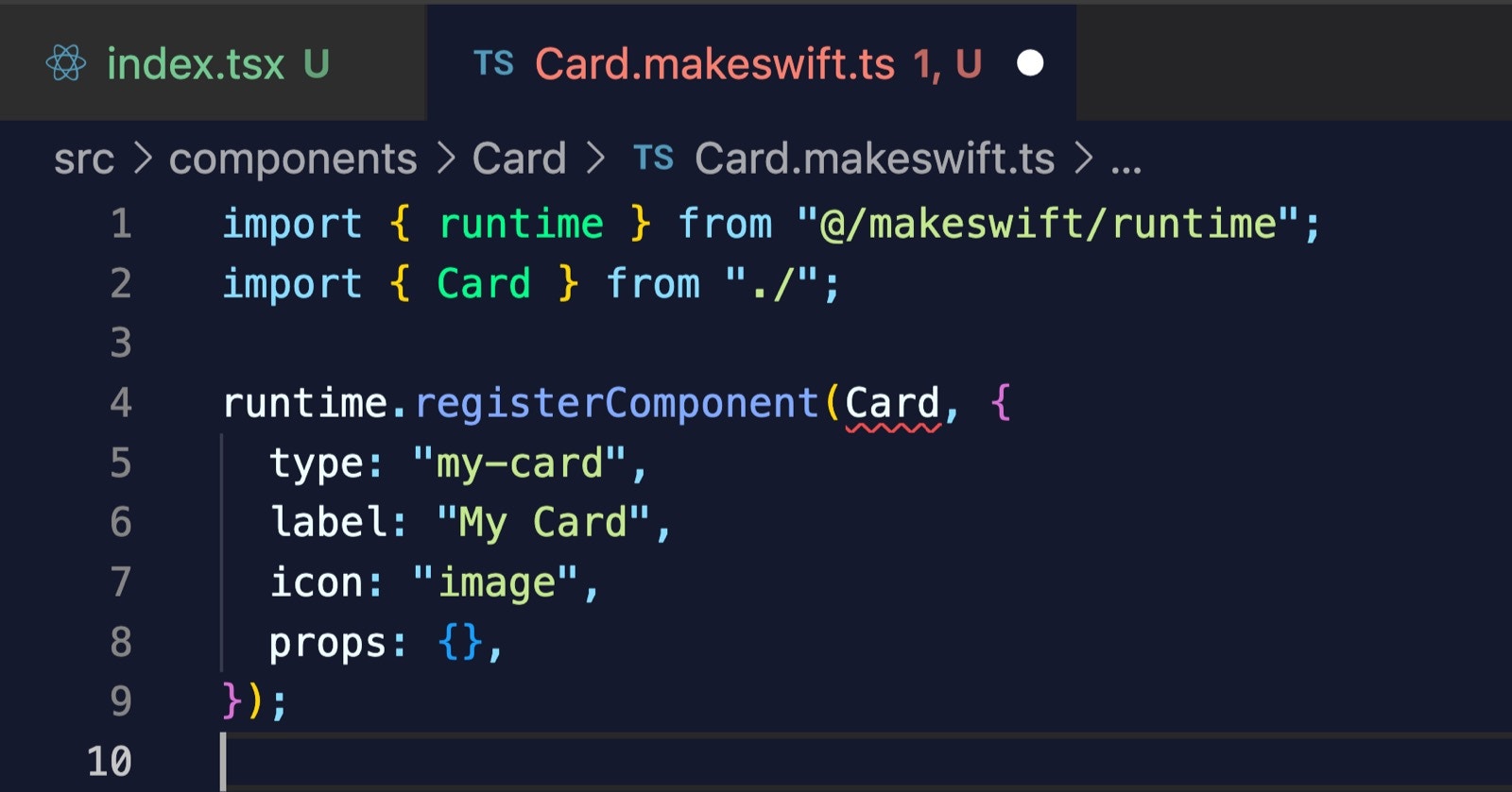
props accordingly, this error will go away.
Note also that as we define each of these, we’ll need to import the appropriate control from @makeswift/runtime/controls. We’ll skip this for now, but each import is included in the final registration code for your reference.
Adding a Style control
We can start by using the Style control which allows our component to receive styles that are defined by the user in the Visual Builder. To do this, add a key ofclassName to the props object with a value of Style(). Notice that className matches the name of the prop that our component is expecting. We’ll make sure to match this for each prop we define here.
Style controls allows the user to edit the width and margin for a component.
properties property like so:
Adding a Image control
For theimage property, we can use the Image control.
string to the React component. However, it can also return an object that includes width and height properties like so:
format property set to Image.Format.WithDimensions.
The documentation for each Makeswift control includes a
Prop type section
which defines the structure of the data that is passed to the registered React
component. For an example, refer to the Prop type
section of the Image control.Adding TextInput controls
For theheading property, we can use the TextInput control.
defaultValue here. Because the heading prop in our Card component is marked as required, we must provide the defaultValue. In general, how you define your props in Makeswift should match the interface you’ve defined in your React component.
Let’s continue by adding two more TextInput controls for alt and linkText. Again, we’ll set label and defaultValue for both.
Adding a TextArea control
For thedescription, we want to allow the user to input a larger piece of text, so we can use the TextArea control.
Adding a Link control
Lastly, we can use the Link control for thelink prop.
Card component which is an object that includes href and target properties.
Final registration code
After putting all of these properties together, you’ll get something like this.Importing the component
After creating and registering the component, we need to make sure that Makeswift is aware of it by importing it in three different places.- the root
layout.tsxfile - the Makeswift provider in the
src/makeswift/provider.tsxfile - the dynamic API route in
src/app/api/makeswift/[...makeswift].ts
src/makeswift/components.ts file which is already imported into each of these three places. In this case, you can import your registration file here, and you’ll be good to go.
src/makeswift/components.ts
Final result
To be able to see your component within the Visual Builder, you’ll need your Makeswift site to be connected to your locally running application. Again, follow the Installation guide for details on how to do that if you aren’t already set up. Assuming your Makeswift site is connected, after refreshing the page, you should see your component listed in the Component Tray.