Select
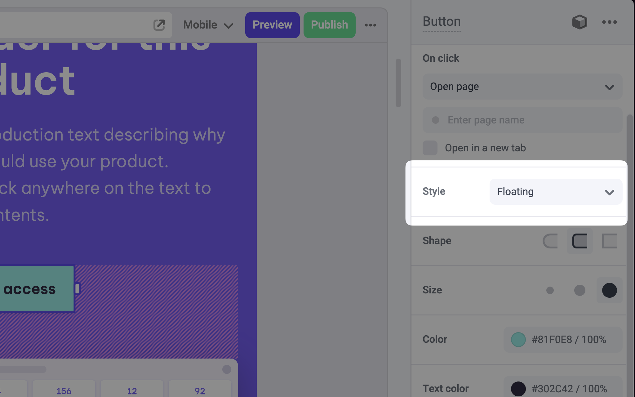
Adds a Select option (dropdown) to a component in the Makeswift builder to visually select a string value.

A Select panel for a Button component to change the style
Params
Text for the panel label in the Makeswift builder.
Orientation of the dropdown label within the panel.
An array of objects of type SelectOption<T> that contains the options available in the panel input.
type SelectOption<T extends string> = {
  value: T
  label: string
}
The label field is displayed in the Makeswift builder.
The value passed to your component when nothing is set in the Makeswift builder.
Prop type
The Select control passes the generic type T from the selected Option to your component. If you don’t set a defaultValue and no value is set in the builder, your component will receive undefined.
Example
The following example adds a Select control to the variant prop of a Button component.
.makeswift.ts is a naming convention for organizing Makeswift registration
code. Read more about this pattern
here.
