Customizing the navbar
Learn how to work with global components in Makeswift.
Global Components are groups of components that can be saved and reused across your entire site. This is a perfect use case for sections that should look the same across all pages like navbars, footers, etc. In fact, the Navbar component in the Venture template is a Global Component.
Editing the navbar
In the top part of the canvas, select the Navbar component. When you click on it, notice you don’t immediately see its properties in the Properties Sidebar. Since this is a Global Component, you must enter edit mode to make changes.
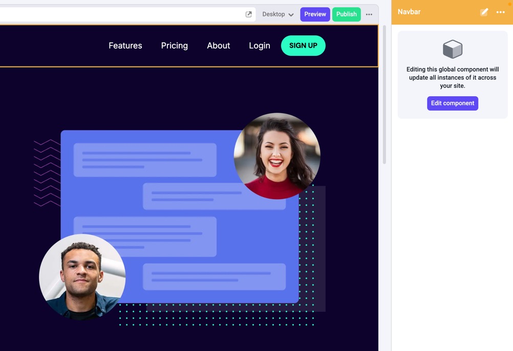
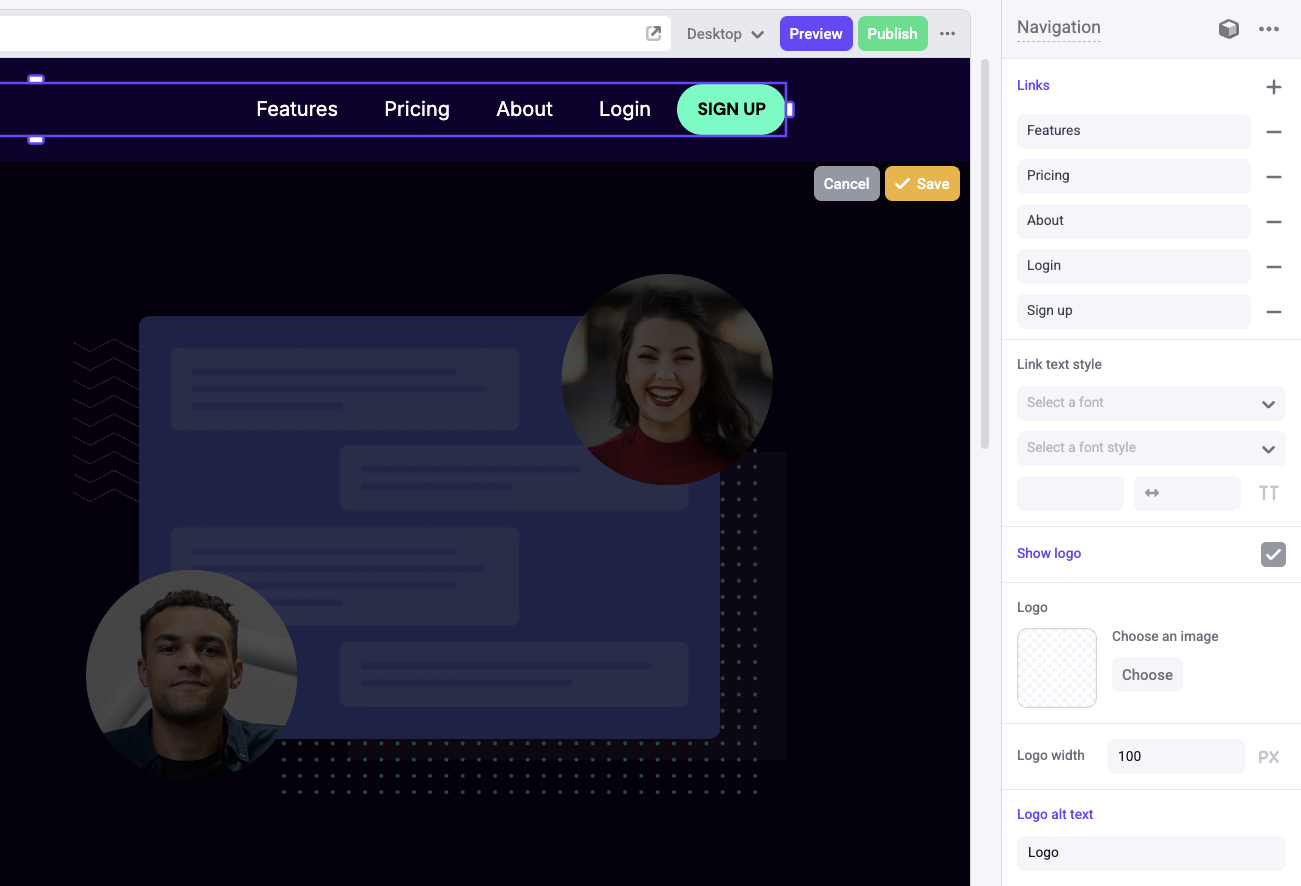
With the Navbar component selected, click Edit component in the Properties Sidebar to enter edit mode. You’ll now see the properties associated with this global component. In the canvas, click on the nested component with the name Navigation. Here you can edit the links in the Navbar component.
Boxes are used to build layouts. They can contain text, images, buttons, and other components. You can add, remove, and rearrange boxes to create your desired layout.
In the Properties Sidebar, click on the Sign up link, and change the color to purple by clicking on the color picker. You should see the color change on the canvas. Then, click Save.
View changes across pages
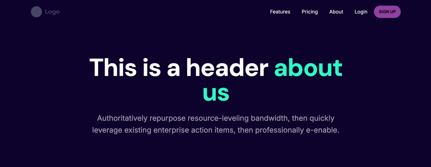
Because this is a global component, you’ll be able to see these changes propogated on other pages that use the Navbar component as well. To see this, click on the About page in the Navigation Sidebar on the left. Once it loads, you should see the Navbar with the purple Sign up button.
For future reference, you can find all of your Global Components in the Component Toolbar. For more details, check out the Global Components docs.
In the next section…
You’ll learn how to incorporate responsive design into your site.