Desktop and mobile
Learn to build responsive designs that look good across desktop and mobile devices.
So far, you’ve only viewed your site on desktop, but Makeswift allows you to preview your site on sizes that simulate desktop, tablet, and mobile. Before previewing on different devices, take another look at the Hero component.
Hero component layout
Notice this section has two columns: one for the text and button on the left and one for an image on the right. This section uses nested Boxes to create this two-column layout. To better visualize this, hover over the heading text to display the Breadcrumbs.
The structure of this section looks like this:
hero- root Box for this section that includes paddinghero-content- nested Box that has two columns of content with a set widthhero-text- left Box containing the text and buttonhero-graphic- right Box containing the image
Preview different screen sizes
With that in mind, let’s take a look at what this layout looks like on a smaller screen. Use the dropdown menu to the right of the URL Bar at the top of the Visual Builder and select Mobile.
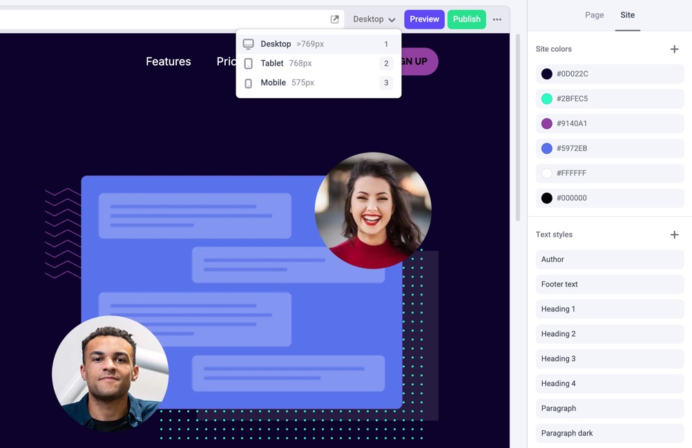
Alternatively, you can also use the following shortcuts: 1 for desktop, 2 for tablet, and 3 for mobile.
If you compare the hero on desktop and mobile, you’ll notice that the layout changes to better fit the screen size by stacking hero-text and hero-graphic vertically.

If you explore the rest of the page, you’ll notice a few other places where the layout has changed:
- The navbar collapses to a hamburger menu
- The list of features is stacked vertically
This is called responsive design. To learn more about how to build responsive designs, check out the Responsive design docs.
Styles always cascade from larger devices to smaller ones. This means you can build your core layout on desktop and then make adjustments for tablet and mobile.
How to build a responsive layout
To see how the responsive design for the hero was built, switch the view to desktop and select the hero-content component. Then, hover on the line that divides the two columns (text on the left and the image on the right). Your cursor will show an arrow pointing down and to the left. Clicking there will allow you to stack the two columns vertically. To undo this, you can hover over the line separating the two rows and click the arrow pointing up and to the right.
This is a common pattern for mobile layouts, and is what has already been taken care of for you with this template.