This tutorial walks you through how to build an accordion component in Makeswift. Instead of building an accordion from scratch, we’ll leverage the Radix UI react accordion component. Then, we’ll register it with Makeswift and use Makeswift controls to enable it to be visually editable.

At the end, you’ll get a feel for how to build built-in components for Makeswift and make them editable using controls.

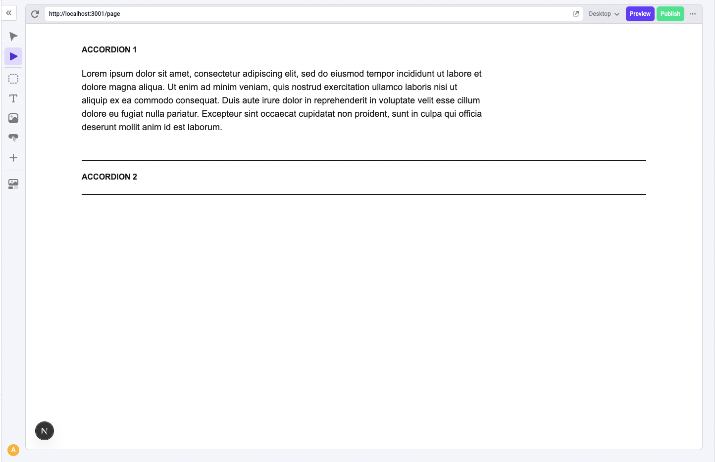
Here’s a sneak peak of the final component:

Prerequisites

  1. Create a new Makeswift site: We’re going to start with the Visual Builder and choose a blank template. Create a new blank page in the Navigation Sidebar.

  2. Create a Next.js app: Follow the Automatic Installation instructions and make sure to include Typescript and Tailwind CSS. Then, follow the App Router Installation guide to connect your Next.js app to your Makeswift site.

Build the React component

First, we’ll build a React component that we can then integrate into Makeswift.

To follow along, create the folder structure below.

src/
├── components/
    └── Accordion/
        ├── index.tsx
        └── Accordion.makeswift.tsx

Let’s start by creating a component with a basic div element inside of index.tsx.

src/components/Accordion/index.tsx
export function Accordion() {
  return <div>Hello World</div>;
}

Register the component with Makeswift

For components to become available to use inside of Makeswift, they need to be registered. We’ll do this in the Accordion.makeswift.tsx file.

Here, we’ll reference the runtime that was created during the installation step to call its registerComponent function and pass the React component we just created as the first prop. Then, we’ll need to pass a configuration object with the following properties.

  • type: serves as an identifier for the component
  • label: shows up as its name in Makeswift
  • props: uses Makeswift controls to pass props to the React component. We’ll leave the props empty for now
src/components/Accordion/Accordion.makeswift.tsx
import { runtime } from "src/makeswift/runtime";

import { Accordion } from "./";

runtime.registerComponent(Accordion, {
  type: "accordion",
  label: "Accordion",
  props: {},
});

Learn more about registering a component in Makeswift.

Import the registered component

Registered components need to be imported to show up in the Component Tray.

We can copy the following line into our src/makeswift/components.tsx file, a file created during the installation step.

src/makeswift/components.tsx
import "src/components/Accordion/Accordion.makeswift";

Now, in Makeswift, we should see the Accordion component in the Component Toolbar, which we can then drag into the Canvas.

Once we drag the component onto the Canvas, notice the label we defined in the Accordion.makeswift.tsx appears in the Properties Sidebar. Later, when we make the component editable in Makeswift, properties that can be edited will appear here.

Build the Accordion component

Let’s leverage the Radix UI react accordion component to help us out. Stop your application and run the following command to install it:

npm install @radix-ui/react-accordion

In the index.tsx file, update your Accordion component to use the radix UI React accordion component. The example uses filler content for each accordion item. Each item has a title that triggers the expansion of its associated content.

src/components/Accordion/index.tsx
import * as BaseAccordion from "@radix-ui/react-accordion";

export function Accordion() {
  return (
    <BaseAccordion.Root type="single">
      <BaseAccordion.Item key="1" value={`item-${1}`}>
        <BaseAccordion.Trigger>Accordion 1</BaseAccordion.Trigger>
        <BaseAccordion.Content>
          Lorem ipsum dolor sit amet, consectetur adipiscing elit
        </BaseAccordion.Content>
      </BaseAccordion.Item>

      <BaseAccordion.Item key="2" value={`item-${2}`}>
        <BaseAccordion.Trigger>Accordion 2</BaseAccordion.Trigger>
        <BaseAccordion.Content>
          Lorem ipsum dolor sit amet, consectetur adipiscing elit
        </BaseAccordion.Content>
      </BaseAccordion.Item>
    </BaseAccordion.Root>
  );
}

Restart your development server. You’ll see your changes reflected in the Makeswift Builder, but when you click the Accordion title, notice that it doesn’t expand. That’s because Makeswift starts in Build mode by default, which is designed for selecting components and editing their properties. To test behaviors like expanding the accordion, you need to be able to interact with the page as a user would. To do that, switch to Interact mode using the Component Toolbar.

To make this a more realistic example, we can create an array of accordion items, then use accordions.map to create an <Accordion.Item> for each one:

src/components/Accordion/index.tsx
import * as BaseAccordion from "@radix-ui/react-accordion";

export function Accordion() {
  const accordions = [
    {
      title: "Accordion 1",
      content: "Lorem ipsum dolor sit amet, consectetur adipiscing elit",
    },
    {
      title: "Accordion 2",
      content: "Lorem ipsum dolor sit amet, consectetur adipiscing elit",
    },
  ];

  return (
    <BaseAccordion.Root type="single">
      {accordions.map((accordion, i) => (
        <BaseAccordion.Item key={i} value={`item-${i}`}>
          <BaseAccordion.Trigger>{accordion.title}</BaseAccordion.Trigger>
          <BaseAccordion.Content>{accordion.content}</BaseAccordion.Content>
        </BaseAccordion.Item>
      ))}
    </BaseAccordion.Root>
  );
}

Make the component editable in Makeswift

Our current example hardcodes the accordion content. We’re now going to make our component editable in Makeswift by using controls to accept user input for each accordion item.

Makeswift controls allow you to map component props to UI elements—such as inputs, lists, and panels— that appear in the Properties Sidebar when the component is selected.

Accordion items

We want you to be able to edit the title for each accordion item in the component and input as many accordion items as you want in Makeswift.

First, adjust the index.tsx file so that the component receives the accordions prop. The accordions prop should receive the title for each item from the Properties Sidebar as an array of strings.

src/components/Accordion/index.tsx
import * as BaseAccordion from "@radix-ui/react-accordion";

type Props = {
  accordions: string[];
};

export function Accordion({ accordions }: Props) {
  if (accordions?.length === 0) return <p>There are no accordions</p>;

  return (
    <div>
      <BaseAccordion.Root type="single">
        {accordions.map((accordion, i) => (
          <BaseAccordion.Item key={i} value={`item-${i}`}>
            <BaseAccordion.Trigger>
              <div>{accordion}</div>
            </BaseAccordion.Trigger>

            <BaseAccordion.Content>Accordion Content</BaseAccordion.Content>
          </BaseAccordion.Item>
        ))}
      </BaseAccordion.Root>
    </div>
  );
}

Next, we’ll pass the accordions prop to the component in the Accordion.makeswift.ts file.

Let’s start by using the TextInput control to define the prop. This makes the prop editable via a text field in Makeswift.

To use the control, we need to import it into the Accordion.makeswift.ts file and then add it to the prop.

src/components/Accordion/Accordion.makeswift.tsx
import { TextInput } from "@makeswift/runtime/controls";

import { runtime } from "src/makeswift/runtime";

import { Accordion } from "./";

runtime.registerComponent(Accordion, {
  type: "accordion",
  label: "Accordion",
  props: {
    accordions: TextInput({
      label: "Title",
      defaultValue: "Accordion Title",
    }),
  },
});

At the moment, the accordions prop is receiving only one title from Makeswift. We’re passing the prop as a string from the TextInput control, but we actually want the user to be able to add multiple accordion items, not just one.

To support this, we can add the List control and put the title inside of it. Once you use the List control to define the accordions prop, the prop should receive an array of strings instead.

src/components/Accordion/Accordion.makeswift.tsx
import { TextInput, List } from "@makeswift/runtime/controls";

import { runtime } from "@/makeswift/runtime";

import { Accordion } from "./";

runtime.registerComponent(Accordion, {
  type: "accordion",
  label: "Accordion",
  props: {
    accordions: List({
      label: "Accordion",
      type: TextInput({ label: "Title", defaultValue: "Accordion Title" }),
      getItemLabel(accordionItem) {
        return accordionItem ?? "Accordion Title";
      },
    }),
  },
});

To recap, we’ve adjusted the Accordion component to receive input from Makeswift through the accordions prop.

Once you refresh the page, you should be able to input accordion items and edit their titles in the Properties Sidebar after you click on the component.

Accordion item content

The goal is to let you edit not just the accordion item titles, but also the body content in Makeswift.

To do this, adjust the index.tsx file so that the component receives both a title and content property for each item in the accordions prop.

src/components/Accordion/index.tsx
import * as BaseAccordion from "@radix-ui/react-accordion";

type AccordionItem = {
  title: string;
  content: string;
};

type Props = {
  accordions: AccordionItem[];
};

export function Accordion({ accordions }: Props) {
  if (accordions?.length === 0) return <p>There are no accordions</p>;

  return (
    <div>
      <BaseAccordion.Root type="single">
        {accordions.map((accordion, i) => (
          <BaseAccordion.Item key={i} value={`item-${i}`}>
            <BaseAccordion.Trigger>
              <div>{accordion.title}</div>
            </BaseAccordion.Trigger>

            <BaseAccordion.Content>{accordion.content}</BaseAccordion.Content>
          </BaseAccordion.Item>
        ))}
      </BaseAccordion.Root>
    </div>
  );
}

Next, we’ll need to update the accordions prop in the Accordion.makeswift.ts file so that it includes not just the title, but also the content, for each accordion item.

To support this, we can use the Group control to define each accordion item as an object. The Group control requires that you define the object properties, in our case, the title and content, as its own props. Once you use the Group control, the prop should receive an array of objects instead.

src/components/Accordion/Accordion.makeswift.tsx
import { TextInput, List, Group } from "@makeswift/runtime/controls";

import { runtime } from "@/makeswift/runtime";

import { Accordion } from "./";

runtime.registerComponent(Accordion, {
  type: "accordion",
  label: "Accordion",
  props: {
    accordions: List({
      label: "Accordion",
      type: Group({
        label: "Accordion",
        preferredLayout: Group.Layout.Inline,
        props: {
          title: TextInput({
            label: "Title",
            defaultValue: "Accordion Title",
          }),
          content: TextInput({
            label: "Content",
            defaultValue: "Accordion Content",
          }),
        },
      }),
      getItemLabel(accordionItem) {
        return accordionItem?.title || "Accordion Title";
      },
    }),
  },
});

We can now edit not only the title, but also the content for each accordion item.

We can also use richer content (e.g. images) by switching the item body to use the Slot control.

For convention, let’s also change the name of the prop to children.

src/components/Accordion/Accordion.makeswift.tsx
import { runtime } from "src/makeswift/runtime";

import { List, Group, TextInput, Slot } from "@makeswift/runtime/controls";

import { Accordion } from "./";

runtime.registerComponent(Accordion, {
  type: "accordion",
  label: "Accordion",
  props: {
    accordions: List({
      label: "Accordion",
      type: Group({
        label: "Accordion",
        preferredLayout: Group.Layout.Inline,
        props: {
          title: TextInput({
            label: "Title",
            defaultValue: "Accordion Title",
          }),
          children: Slot(),
        },
      }),
      getItemLabel(accordionItem) {
        return accordionItem?.title || "Accordion Title";
      },
    }),
  },
});

Next, adjust the index.tsx file to receive the children prop.

src/components/Accordion/index.tsx
import { ReactNode } from "react";

import * as BaseAccordion from "@radix-ui/react-accordion";

type AccordionItem = {
  title: string;
  children?: ReactNode;
};

type Props = {
  accordions: AccordionItem[];
};

export function Accordion({ accordions }: Props) {
  if (accordions?.length === 0) return <p>There are no accordions</p>;

  return (
    <div>
      <BaseAccordion.Root type="single">
        {accordions.map((accordion, i) => (
          <BaseAccordion.Item key={i} value={`item-${i}`}>
            <BaseAccordion.Trigger>
              <div>{accordion.title}</div>
            </BaseAccordion.Trigger>

            <BaseAccordion.Content>{accordion.children}</BaseAccordion.Content>
          </BaseAccordion.Item>
        ))}
      </BaseAccordion.Root>
    </div>
  );
}

Since the children prop is rendered inside of the content of the accordion, we need to expand the accordion to be able to access the slot:

  • Switch to Interactive mode.
  • Expand the accordion item by clicking on its title.
  • Switch back to Build mode
  • Drag a component, in this case, the text component into the slot.
  • Edit the content of the text component.

Styling the accordion

We can edit a component’s width, margin, and alignment in Makeswift by using the Style Control.

First, update the component in the index.tsx file so that it receives the className prop and use the class on the accordion component.

src/components/Accordion/index.tsx
import { ReactNode } from "react";

import * as BaseAccordion from "@radix-ui/react-accordion";

type AccordionItem = {
  title: string;
  children?: ReactNode;
};

type Props = {
  className: string;
  accordions: AccordionItem[];
};

export function Accordion({ className, accordions }: Props) {
  if (accordions?.length === 0) return <p>There are no accordions</p>;

  return (
    <BaseAccordion.Root type="single" className={className}>
      {accordions.map((accordion, i) => (
        <BaseAccordion.Item key={i} value={`item-${i}`}>
          <BaseAccordion.Trigger>
            <div>{accordion.title}</div>
          </BaseAccordion.Trigger>

          <BaseAccordion.Content>{accordion.children}</BaseAccordion.Content>
        </BaseAccordion.Item>
      ))}
    </BaseAccordion.Root>
  );
}

Next, we’ll pass the className prop to the component in the Accordion.makeswift.ts file. The prop should use the Style control.

src/components/Accordion/Accordion.makeswift.tsx
import { runtime } from "src/makeswift/runtime";

import {
  List,
  Group,
  TextInput,
  Slot,
  Style,
} from "@makeswift/runtime/controls";

import { Accordion } from "./";

runtime.registerComponent(Accordion, {
  type: "accordion",
  label: "Accordion",
  props: {
    className: Style(),
    accordions: List({
      label: "Accordion",
      type: Group({
        label: "Accordion",
        preferredLayout: Group.Layout.Inline,
        props: {
          title: TextInput({
            label: "Title",
            defaultValue: "Accordion Title",
          }),
          children: Slot(),
        },
      }),
      getItemLabel(accordionItem) {
        return accordionItem?.title || "Accordion Title";
      },
    }),
  },
});

By default, we can edit the width, margin, and alignment of text components in Makeswift. Since the accordion content was a text component, we didn’t need to add the Style control for the accordion content. We could also edit the font typography for text in the accordion content.

Tailwind CSS

We can use tailwind CSS to further style the component. In the example, the CSS styling adds a border, padding, and font styling to each accordion item.

src/components/Accordion/index.tsx
import { ReactNode } from "react";

import * as BaseAccordion from "@radix-ui/react-accordion";

type AccordionItem = {
  title: string;
  children?: ReactNode;
};

type Props = {
  className: string;
  accordions: AccordionItem[];
};

export function Accordion({ className, accordions }: Props) {
  if (accordions?.length === 0) return <p>There are no accordions</p>;

  return (
    <BaseAccordion.Root type="single" className={className}>
      {accordions.map((accordion, i) => (
        <BaseAccordion.Item
          key={i}
          value={`item-${i}`}
          className="border-b-2 py-2"
        >
          <BaseAccordion.Trigger className="py-4">
            <div className="font-extrabold uppercase">{accordion.title}</div>
          </BaseAccordion.Trigger>

          <BaseAccordion.Content className="pb-6">
            {accordion.children}
          </BaseAccordion.Content>
        </BaseAccordion.Item>
      ))}
    </BaseAccordion.Root>
  );
}

Here’s what the final result looks like.

Next steps

There’s much more we can edit in Makeswift! Check out the list of Controls in our documentation.