Style
Add a Style control to your component in the Makeswift builder to visually edit a CSS class string prop.
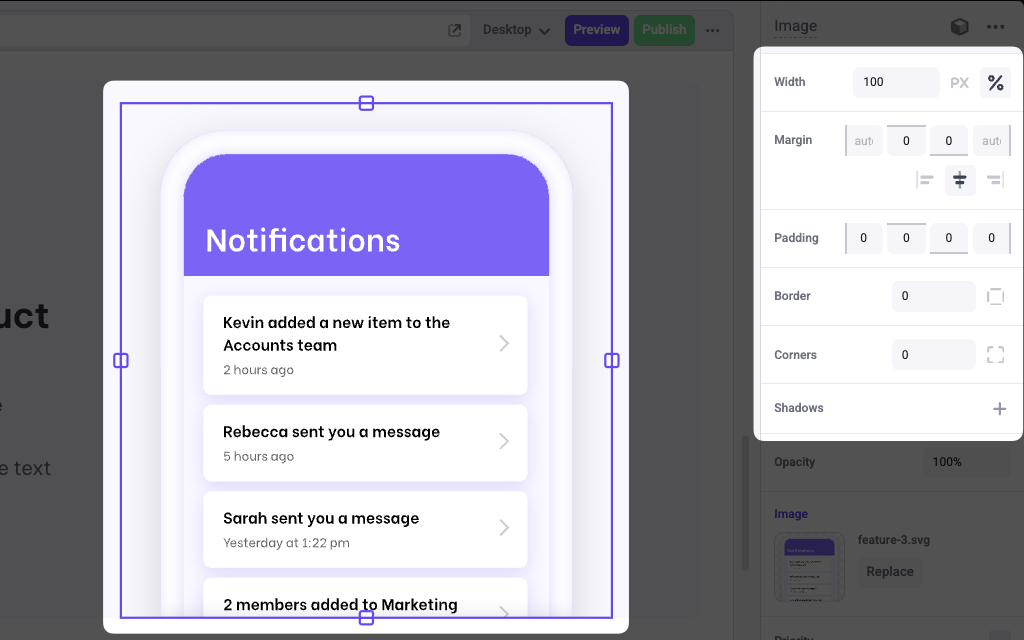
The Style control is the only control that is responsive; its values can be changed at different viewport sizes without affecting the others. For example, you could set a width of 1200px in desktop and 100% in mobile.
Params
properties
An array of style properties that can be visually edited. These values include:
Style.WidthStyle.MarginStyle.PaddingStyle.BorderStyle.BorderRadiusStyle.TextStyle
The following presets are also available:
Style.Defaultwhich is equivalent to[Style.Width, Style.Margin]Style.Allwhich includes all properties.
Example
The following example adds a Style control to the className prop of an Image component.
.makeswift.ts is a naming convention for organizing Makeswift registration code. Learn more.