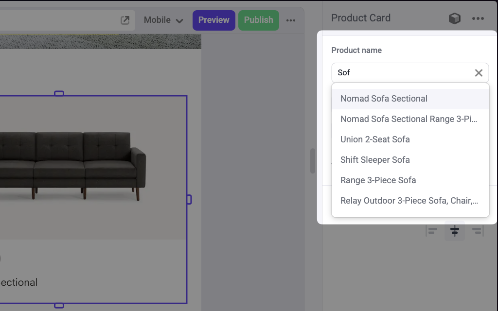
A Combobox panel on a Product Card component to pick a product by name

Params

label
string
default:"Text"
Text for the panel label in the Makeswift builder.
description
string
The description shown in the Panel of the Makeswift builder. This can be written in Markdown format. Added in v0.24.8.
getOptions
getComboboxOptions<T>
required
A function that receives a query string and returns an array of type Option<T>. This function may be async to fetch options asynchronously.
type getComboboxOptions<T> = (
  query: string
) => ComboboxOption<T>[] | Promise<ComboboxOption<T>[]>;

type ComboboxOption<T> = {
  id: string;
  label: string;
  value: T;
};
The label field is displayed in the Makeswift builder and id must be unique.

Prop type

The Combobox control passes the generic type T from the selected Option to your component, or undefined if there is no value set in the builder.

Example

The following example adds a Combobox control to the product prop of a Product Card component.
import { Combobox } from "@makeswift/runtime/controls";

import { fetchProducts } from "@/lib/fetchers";
import { runtime } from "@/makeswift/runtime";

import { ProductCard } from "./ProductCard";

runtime.registerComponent(ProductCard, {
  type: "product-card",
  label: "Product Card",
  props: {
    product: Combobox({
      label: "Product name",
      async getOptions(query) {
        const products = await fetchProducts();

        return products
          .map((product) => ({
            id: product.id,
            label: product.name,
            value: product,
          }))
          .filter((option) =>
            option.label.toLowerCase().includes(query.toLowerCase())
          );
      },
    }),
  },
});
.makeswift.ts is a naming convention for organizing Makeswift registration code. Learn more.