Params
Text for the panel label in the Makeswift builder.
The description shown in the Panel of the Makeswift builder. This can be written in Markdown format.
Added in
v0.24.8.Orientation of the number label within the panel.
The value passed to your component when nothing is set in the Makeswift
builder.
The smallest number that can be set in the panel input.
The largest number that can be set in the panel input.
The increment amount when using the ↑ ↓ arrows or dragging the panel input.
Decorative text appended to the end of the panel input.
Prop type
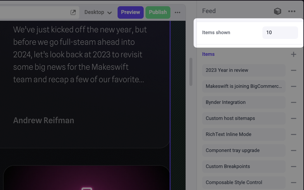
The Number control passes anumber to your component. If you don’t set a defaultValue and no value is set in the builder, your component receives undefined.
Example
.makeswift.ts is a naming convention for organizing Makeswift registration
code. Learn
more.