
Image
Adds an Image panel in the Makeswift builder to visually edit an image prop.

The panel has two tabs, so an image can come from either the files manager or an external URL:
- Files — Clicking “Choose” or “Replace” opens the Makeswift files manager, where you can upload an image or select an existing one from your media library.
- URL — Paste the URL of an image hosted anywhere else.
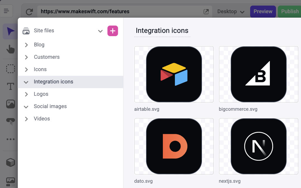
Your component receives the image URL in both cases, whether the value points at a Makeswift file or an external URL.
External images don’t always carry width and height data. When format is set to Image.Format.WithDimensions and the external image has no dimensions, your component receives undefined and the runtime logs a warning.
Params
Text for the panel label in the Makeswift builder.
The description shown in the Panel of the Makeswift builder. This can be written in Markdown format.
Added in v0.24.8.
Changes the prop type this component receives. If set to Image.Format.URL, your component receives a string value of the image url. If set to Image.Format.WithDimensions, your component receives an object of type ImageWithDimensions. This format is useful when using components like next/image that require you to pass the image dimensions as props.
Prop type
If format is set to Image.Format.URL, the prop type is string.
If format is set to Image.Format.WithDimensions, the prop type is ImageWithDimensions.
Example
The following examples adds an Image control to the icon prop of a Feature Card component.
Using Image.Format.URL
Using Image.Format.WithDimensions
.makeswift.ts is a naming convention for organizing Makeswift registration code. Learn more.