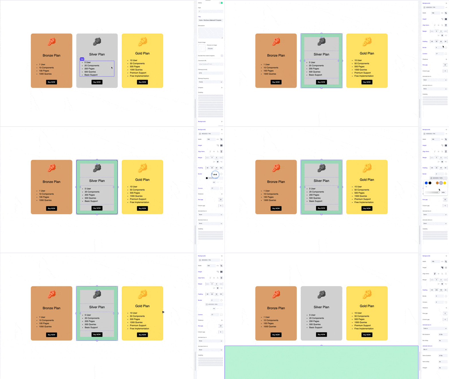
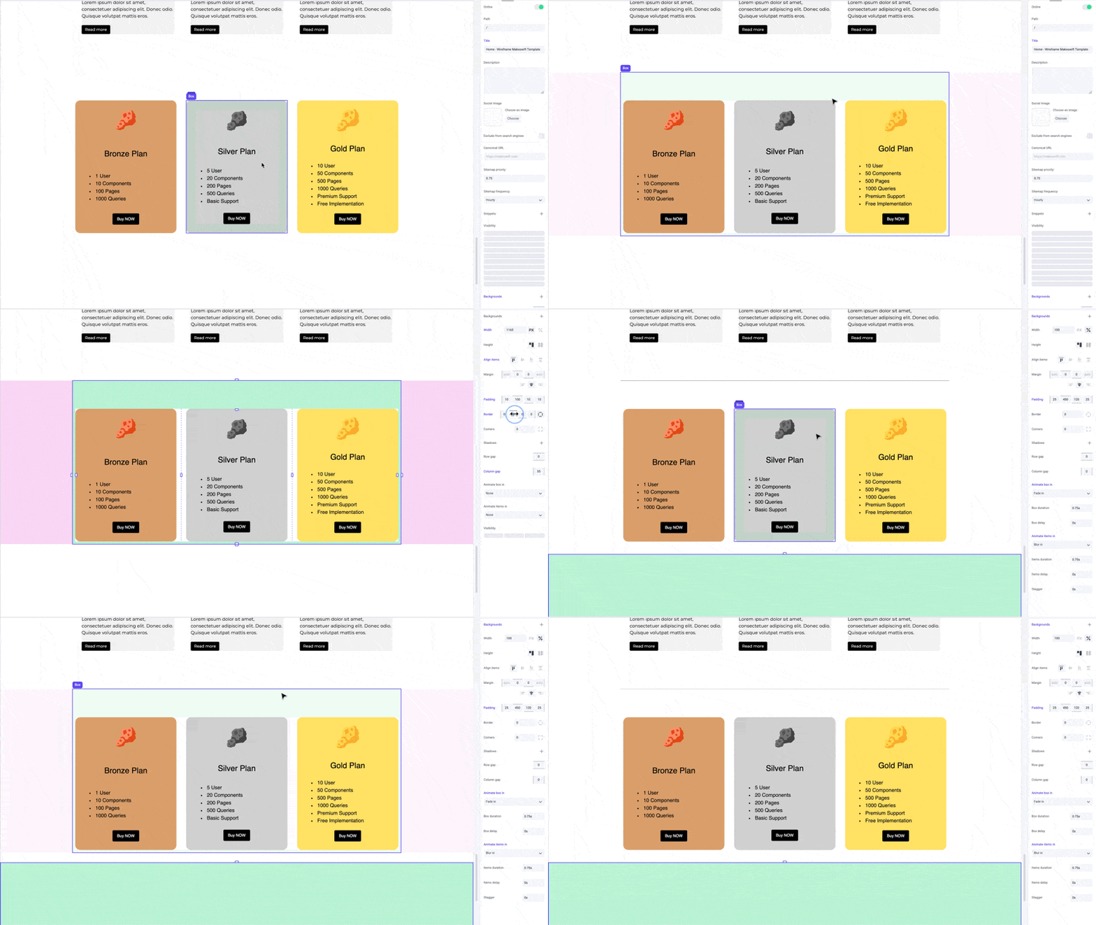
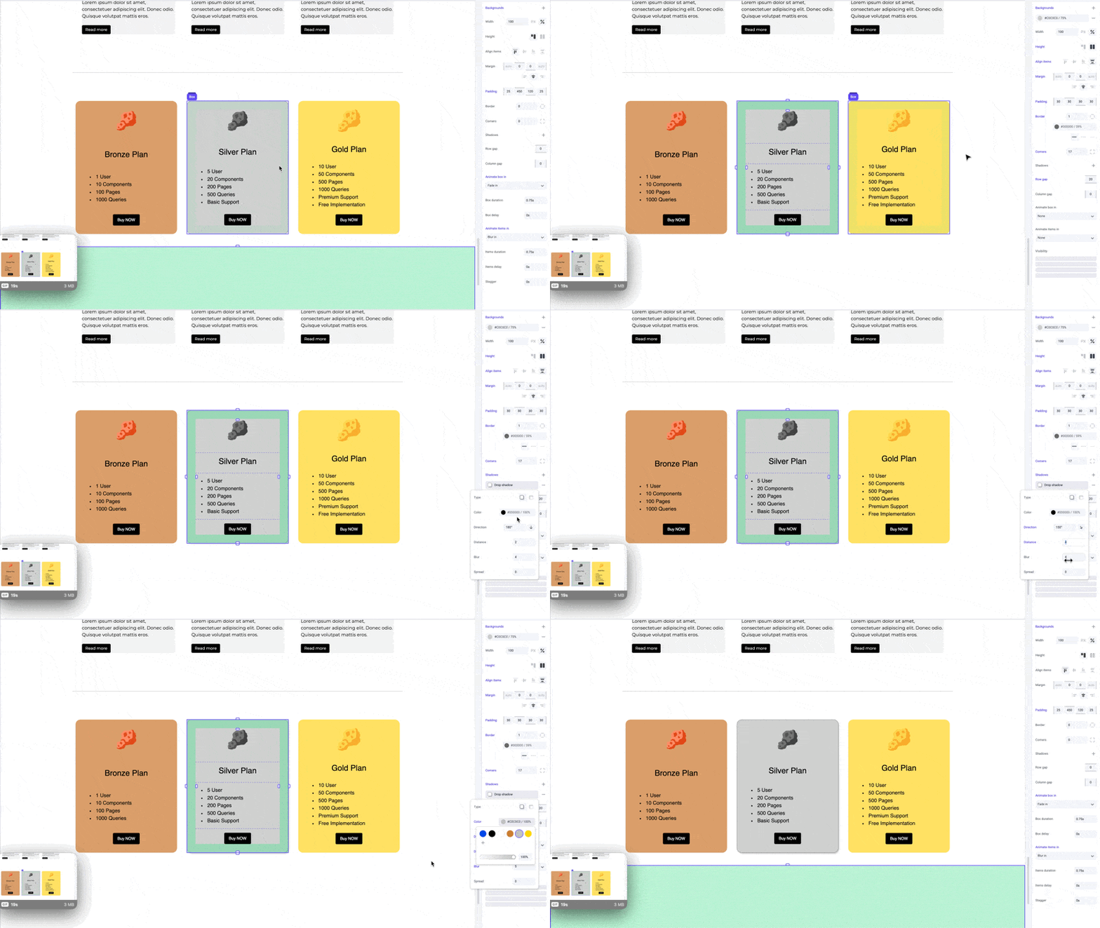
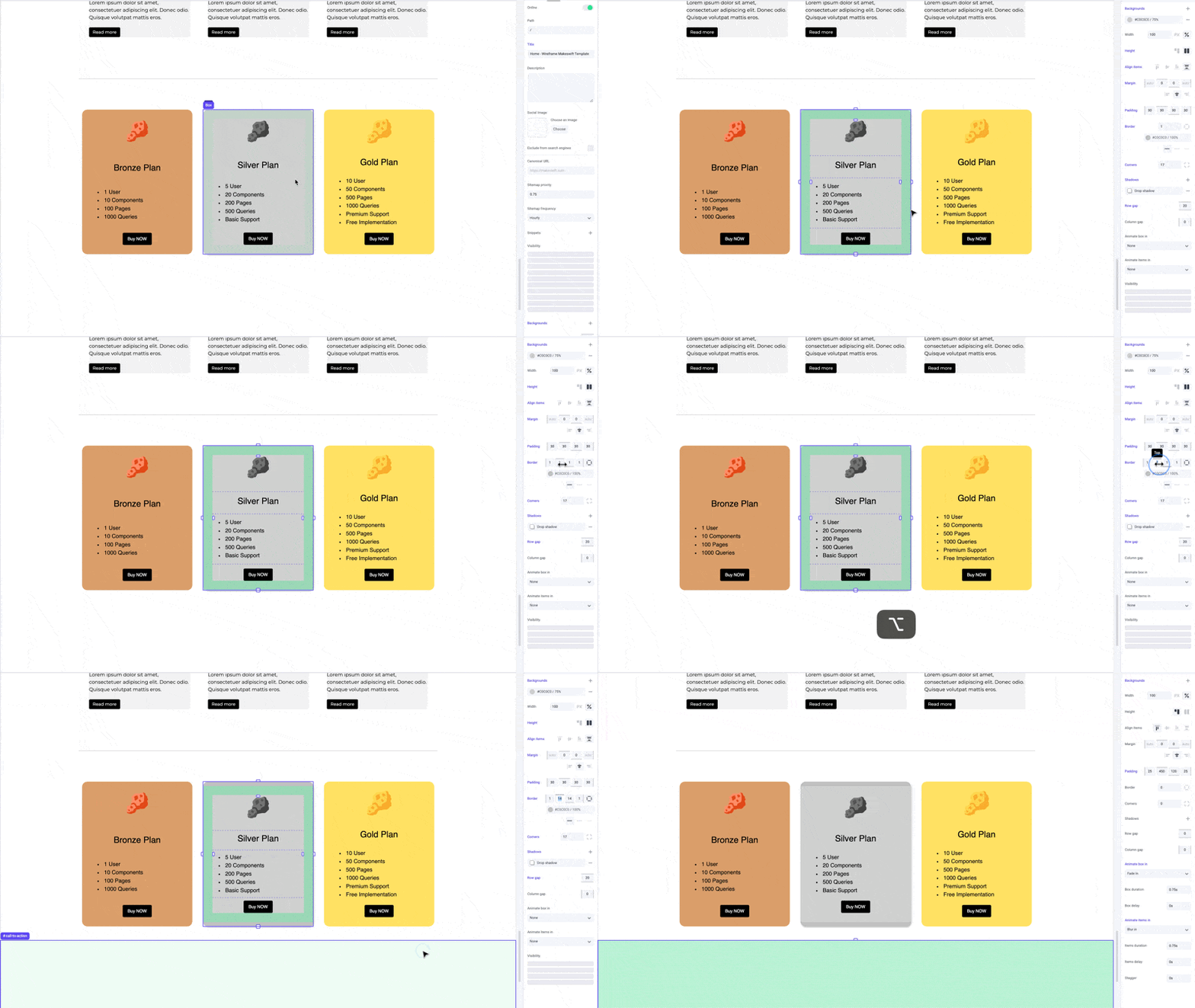
Thickness
Thickness refers to the width of the border around an element. Specifying border thickness helps create elements with varying visual emphasis, from subtle accents to bold outlines.Color
You can select from your site colors to use as a border color. Customizing border color adds visual interest, creates contrast, and reinforces branding.Style
Choose from styles like dotted, dashed, or solid lines to suit different design preferences. Dotted lines create a pattern of small dots; dashed lines consist of short dashes separated by spaces; and solid lines provide a continuous, unbroken border.Examples
Apply borders to boxes to make them pop out as cards.

Pro tips
Borders complement shadows, giving your boxes a crisper edge and emphasizing the depth of the shadow. Lower the border color opacity to create a more subtle effect.
Shortcuts
While dragging the border panel inputs, hold the⌥ Option or Alt key to equally change border width on both sides of an element. Hold ⇧ Shift + ⌥ Option or Alt to equally change border width for all sides.

