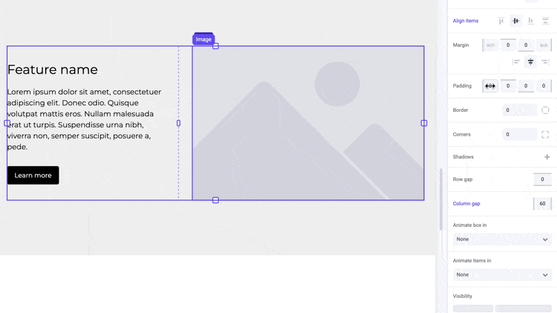
Padding
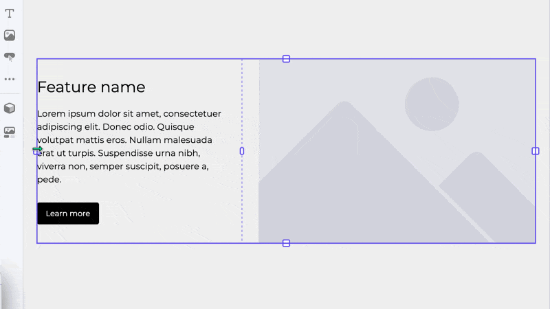
Padding is the space created between a box’s border and its contents. This differs from margin which is used to push elements away from each other.
Boxes contain extra handles on the inside when selected. Grab any of these inner handles to change its padding, which is displayed in green.
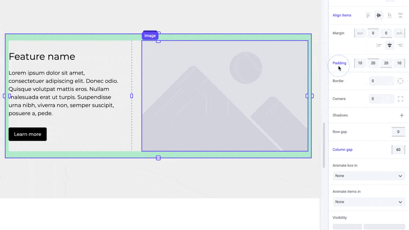
By adjusting the padding, you can create breathing room between the box’s content and its borders, preventing elements from feeling cramped or cluttered. This differs from margin which is used to create space between smaller elements.
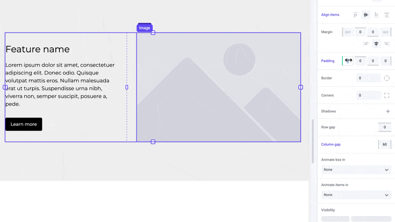
Padding can also be applied using the padding panel in the sidebar.
You can also easily remove a box’s padding by clicking the blue Padding label in the panel and selecting “Reset to base”.
Examples
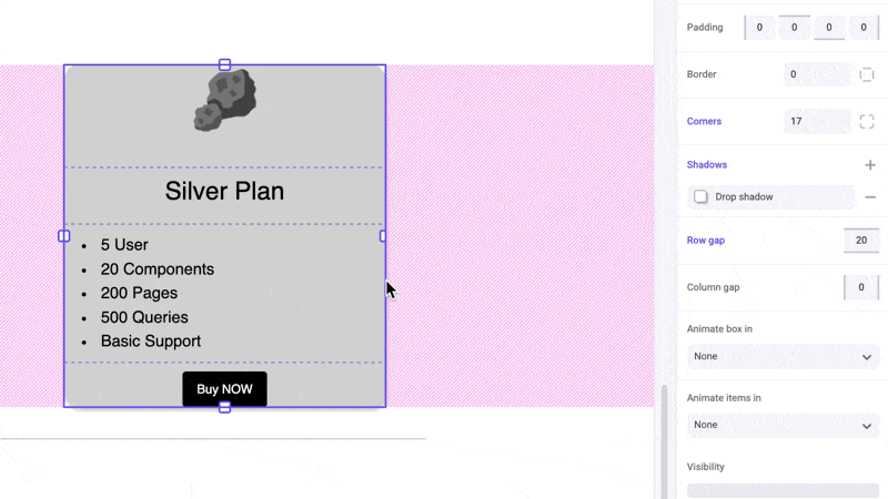
Cards
Use padding to ensure content is not touching the edge of the card. This will make the card more visually appealing and easier to read. This is also easier to manage as opposed to applying width on each individual element within the card.
Pro tip
Avoid using padding instead of width for boxes. Width allows your element to resize responsively while maintaining a limit to prevent it from becoming too wide on larger screens. Padding is a hard pixel value that does not automatically get reduced and will cause your content to be squished on smaller devices.
Shortcuts
While dragging the handles or inputs, hold the ⌥ Option or Alt key to equally change padding on both sides of an element. Hold ⇧ Shift + ⌥ Option or Alt to equally change padding for all sides.
Developer notes
You can give your team control over the padding property for any custom component using the Style control.