Margin
Margin is the space between elements, similarly to padding it allows you to create spacing around elements, ensuring proper alignment, readability, and visual balance within a layout.
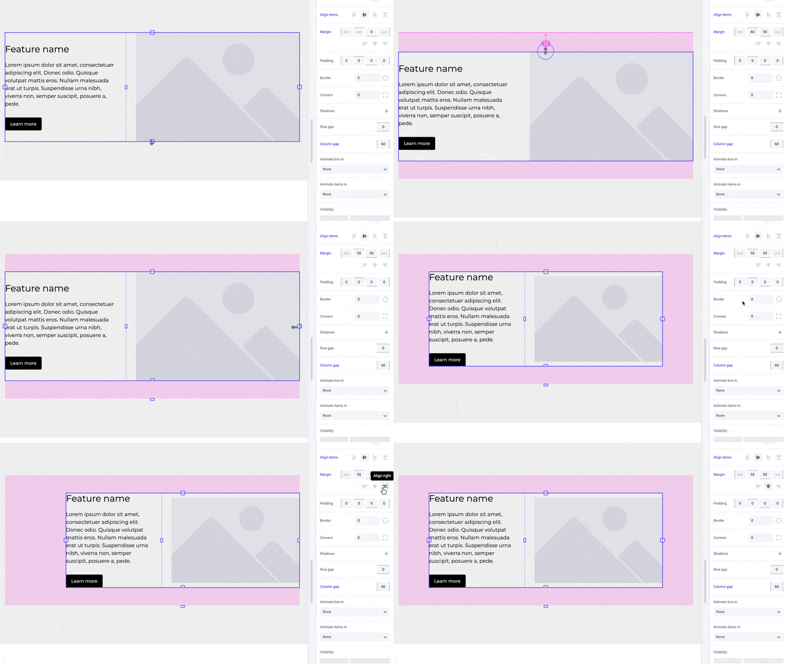
By adjusting the margin, you can create breathing room between content, preventing elements from feeling cramped or cluttered. With an element selected, utilize the margin overlays by dragging the top or bottom handles to change its vertical margin. For a box, they will be the top-most and bottom-most handle
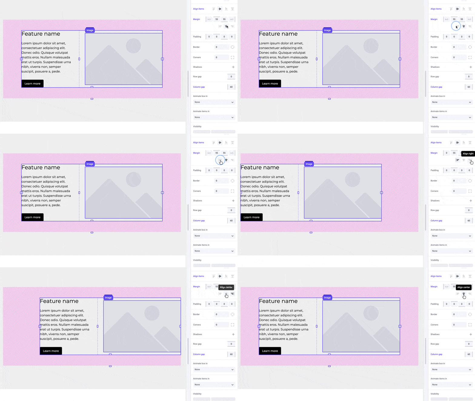
In Makeswift, horizontal alignment is controlled by applying left and right margin values. If you center align your element, it will assume an equal auto
value for left and right margins. For left or right aligned elements, it will assume a margin of 0
on the side that it is aligned to, and an auto
value for the opposite side.
Pro tip
For a list or grid of elements with equal spacing, use the gap control instead of margin. This will ensure consistent and easy to manage spacing between elements.
Shortcuts
Use the preset alignment buttons to quickly center, left, or right align your content. This will automatically adjust the margin values for you.
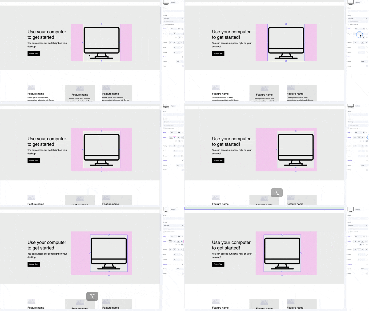
While dragging the margin handles or panel inputs, hold the ⌥ Option
or Alt
key to equally change margin on both sides of an element. Hold ⇧ Shift + ⌥ Option
or Alt
to equally change margin for all sides.
Developer notes
You can give your team control over the margin property for any custom component using the Style control.