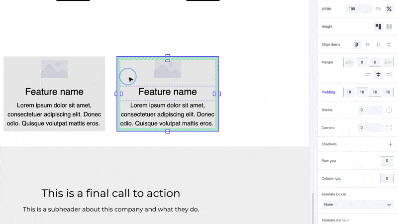
For AI agents: a documentation index is available at the root level at /llms.txt and /llms-full.txt. Append /llms.txt to any URL for a page-level index, or .md for the markdown version of any page.
Sign in
DocsChangelog
DocsChangelog
  • Getting started
    • Introduction
  • The Visual Builder
    • Builder basics
    • Pages
    • Layouts
    • Elements
    • Components
    • Theming
    • Files
    • Responsive design
      • Width
      • Margin
      • Padding
      • Alignment
      • Backgrounds
      • Corners
      • Borders
      • Animations
      • Gap
      • Shadows
      • Height
      • Visibility
  • Guides
    • Previewing and sharing
    • Publishing
    • SEO
  • Settings
    • Developer docs
    • Blog
    • Support
Sign in
LogoLogo
On this page
  • Pro tips
  • Shortcuts
  • Developer notes
The Visual BuilderPanels

Corners

Was this page helpful?
Previous

Backgrounds

Next

Border

Built with

Corners, or border radius, is used to create rounded corners on elements by defining the radius of the element’s corners.

Rounded corners can be applied to all corners uniformly or individually to specific corners. This can be used to create a variety of shapes and effects, such as rounded cards or sections.

Rounded Cards

Pro tips

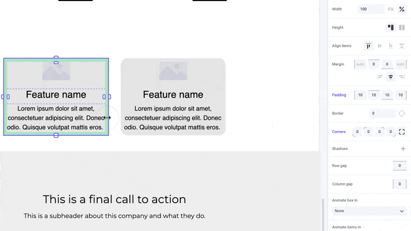
In Makeswift, you’re able to select which corners you want to change the radius for within a box, allowing you to create some interesting effects and shapes. Be sure to keep in mind the contents of your box or element as corner radius does not take content into account.

Selecting different corners

Shortcuts

While dragging the panel inputs for individual corners, hold the ⌥ Option or Alt key to equally change parellel corners of an element. Hold ⇧ Shift + ⌥ Option or Alt to equally change all corners.

⌥Option (or Alt) hotkey

Developer notes

You can give your team control over the corners property for any custom component using the Style control.